All work
Case Study · 2025–2026

UmedMall
Marketplace OS

Designing the client storefront, the moderator console, and the seller portal of a multi-category marketplace — turning three disconnected specs into one coherent system.

Role
Sole Product Designer (Client, Admin & Seller)
Duration
~5 months
Status
Live · official launch in preparation
Company
Alif Technology · for an external client

One marketplace, three specs, written months apart by different people.

UmedMall is a multi-category marketplace built for the Tajik market, benchmarked by the client against OZON, Wildberries, Yandex.Market and Etsy. By the time I joined, a client-side spec already existed. The moderator spec arrived next. The seller/partner spec didn't exist at all — "we'll send it later."

My job was to make sure none of the three surfaces contradicted each other: one taxonomy, one attribute model, one source of truth — expressed through three different interfaces, for three different people, with three different jobs to do.

I designed all three: the client storefront, the moderator console, and the seller portal — research, information architecture, content modeling, UI, and Figma handoff.

13
client storefront sections
19
moderator sections, in 7 nav groups
7
seller portal sections
3 → 1
connected surfaces, one data model

The brief described a database. It needed to describe a workflow.

Business reality

The client's three specs were written sequentially, by different people, with no shared vocabulary. The client-facing catalog and the moderator's "Characteristics" page used different words for the same idea. The seller portal wasn't specified at all when I started designing the moderator side.

Three things were true at once:

  • The moderator spec was, almost literally, a list of database tables: Orders, Categories, Characteristics, Banners, Administrators, Stores.
  • No one had designed how a seller actually lists a product without breaking the catalog for everyone else.
  • "Improve it however you think best" was the actual brief — a blank check that's easy to under-deliver on.

The literal brief, verbatim

This is the entire moderator navigation as originally specified — six flat categories, no grouping, no hierarchy, no mention of units, input types, audit logs, cities, or brands. Sellers were expected to type product attributes as free text.

The original sidebar, as briefed:

"Заказы. Категории. Характеристики. Баннеры. Администраторы. Магазины."

— Orders. Categories. Characteristics. Banners. Administrators. Stores. The whole moderator product, in six words.

No interviews, no usability lab — so I borrowed conviction from competitors and stress-tested the data model instead.

There was no budget or access for primary user research. So I grounded every decision in two things I could control: how mature marketplaces actually structure this problem, and how badly a naive schema would break under real-world data.

Method 01

Competitive IA audit

Walked through the moderator/admin patterns of OZON, Wildberries, Yandex.Market and Etsy — not for visuals, but for how they group catalog management, order processing, and seller onboarding. Reused validated structure instead of inventing one from a flat spec.

Method 02

Cross-spec reconciliation

Read the client-side spec, the moderator spec, and (once it arrived) the seller spec against each other, line by line, looking for contradictions before they became dev tickets — e.g. a "verified store" badge the client side referenced that the moderator side never defined.

Method 03

Edge-case stress-testing

Before designing the attributes screen, I deliberately pushed it with hard cases: temperature in °C/°F/K, length in cm vs. m vs. inches, a washing machine's "8kg, white, automatic" typed as one free-text string. Each broke something — which told me what the schema actually needed to prevent.

Key insights

Insight 01

A literal spec is a schema, not an IA

Six flat top-level items copied from table names hide nineteen real sections. No single moderator should face that list ungrouped.

Insight 02

Free text kills filters before they're built

"Automatic, 8kg, white" typed as one string by one seller can never be filtered, compared, or sorted against the same attributes typed differently by another seller.

Insight 03

Approval needs state integrity, not just a status field

"Approved" and "store exists" must be the same fact, not two fields that can drift apart. The spec never said this — the data model demanded it.

"What if I stopped operating strictly from the spec, and designed what the product actually needed?" — The question I kept asking myself, three weeks in

The brief described three interfaces. The real problem was one trustworthy attribute engine underneath all of them.

Problem statement

The client storefront, the moderator console, and the seller portal each needed to trust the same taxonomy and the same product attributes — without giving sellers enough freedom to enter data that breaks filtering, comparison, or search downstream.

Solve that once, at the data-model level, and three very different interfaces become straightforward to design on top of it.

Goals

  • Unify categories, characteristics and units under one moderator-owned schema that client and seller surfaces simply consume.
  • Replace the literal flat sidebar with navigation grouped by how moderators actually triage work, not by table name.
  • Close every approval loop with a mandatory, visible reason — not just a status change nobody can audit.
  • Design the seller portal from a near-empty spec, mirroring the moderator's data model so every listing imports cleanly.

What "done" had to mean

No flat lists

19 moderator sections collapse into 7 task-based groups, none with more than 4 top-level items.

Zero free-text attributes

Every product attribute is an enum, a number with a unit, or a boolean — never an open string a seller can type anything into.

Every rejection has a reason

Store and product rejections require a mandatory reason, visible to other moderators — no more "why was this declined?" pings.

The decisions nobody asked for are the ones I'm proudest of.

None of the four decisions below were in the original spec. Each one came from asking "what happens when this breaks at scale" before it actually did.

1

A two-level attribute system: moderators define the schema, sellers fill constrained values

Sellers don't get a free-text field for "color" or "capacity." A moderator first defines the characteristic (its input type, its unit, its validation rules) once, globally. Sellers then pick from that fixed vocabulary when listing a product. This single decision is what makes filtering and comparison possible across thousands of listings from hundreds of independent sellers.

2

Base units + conversion, even for attributes nobody asked to compare

Every unit category (length, mass, volume, power, temperature) stores a single base unit internally — Kelvin for temperature, millimeters for length — and converts on display. A seller can enter 25°C or 77°F; the system stores 298.15K either way. Without this, "filter fridges under 90 cm wide" silently fails for every seller who typed “0.9 m.”

3

Collapsing 19 flat items into 7 named, iconified groups — and showing my work

I presented three real alternatives — 6 groups (maximally compact), 7 groups (balanced), and 9 groups (maximally explicit) — with the actual trade-off named out loud: fewer groups for a small moderation team wearing many hats, more groups if responsibilities split by role. The client picked 7, and recognized every group name because it reflected their own vocabulary back to them.

4

Caught a state-integrity bug before it shipped: "approved" must equal "store exists"

The original spec allowed a store application to be marked "Approved" as a status change, separately from actually creating the store record. I flagged that this produces an impossible state — an approved application with no store behind it — and changed the flow so approval is store creation. I also replaced "delete" with "archive" for applications, so rejected history is never lost.

Three surfaces, one system, screen by screen.

One taxonomy and one attribute engine power the client storefront, the moderator console, and the seller portal — color-coded below as Client, Admin and Seller so it's clear which surface each screen belongs to.

Part I · The storefront, where the back office pays off

Client view

Thirteen sections, each drawn twice — desktop and mobile, light and dark. Nothing here is decorative: every filter, every breadcrumb and every color swatch is the visible end of a decision made in the moderator console.
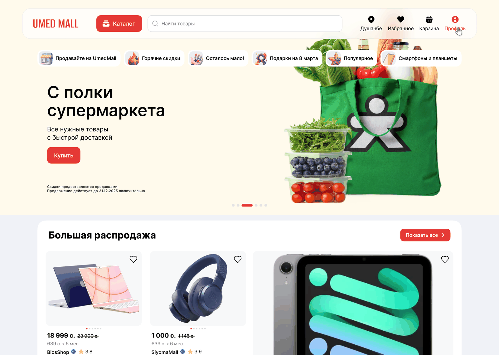
UmedMall storefront home
The home page: banner slider, category tiles and product widgets — all of it assembled by a moderator, not a developer.

Three levels of catalog, against the brief's own instruction

The client-side brief asked for two levels of nesting, maximum. The admin section of the same brief described three: category → subcategory → type. I followed the data, not the sentence — because a type belongs to exactly one subcategory, and breaking that link is what makes a seller's products vanish from the storefront entirely. So the catalog drills three levels deep, with breadcrumbs that never lose the path.

Catalog with three levels
Catalog → category → subcategory, with the path kept visible in the breadcrumb.
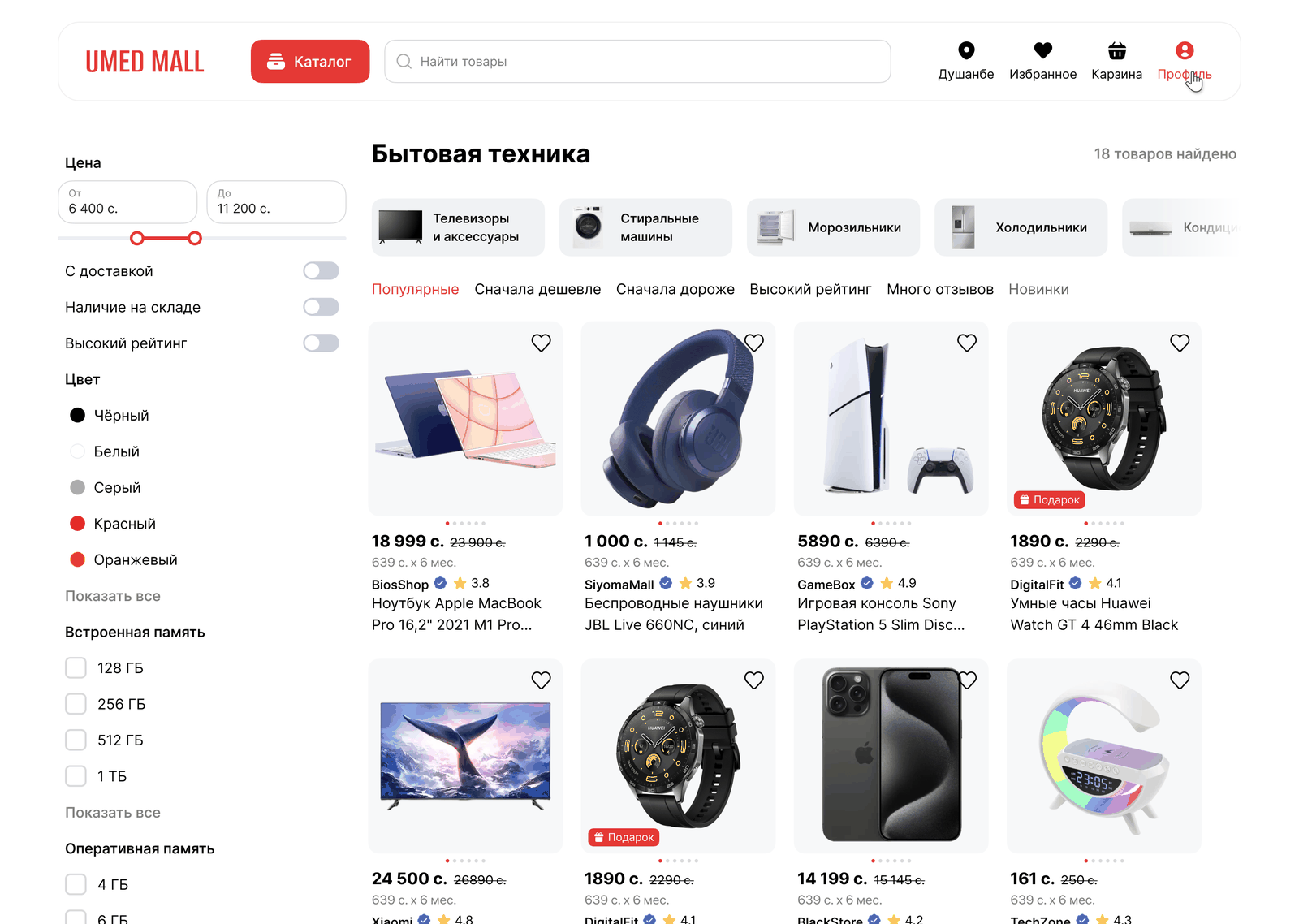
Category page with filters
A category page: price slider, filters built from the attribute engine, and tiles that carry the monthly payment, the seller and their rating.

Installments are not a payment option here — they are the price

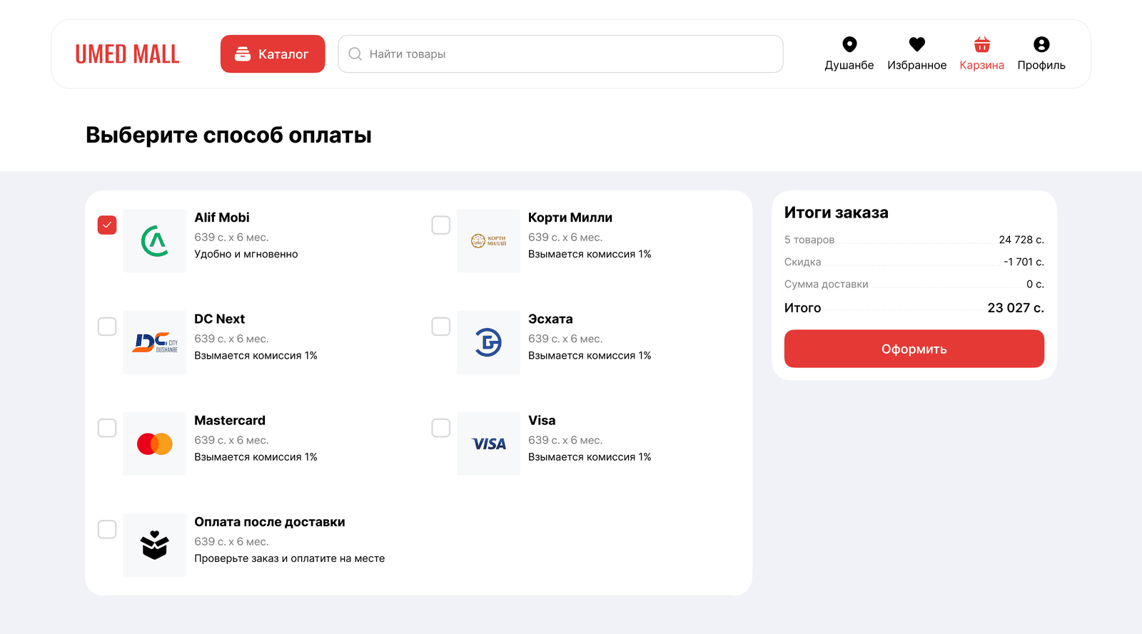
Under every price in the catalog sits a second line: 639 TJS × 6 months. Not on the product page, not at checkout — in the tile, before anything is clicked. In this market a large purchase is normally split into monthly payments, so a price without its installment is only half a price. At checkout the same logic continues: seven ways to pay, most of them local banks, and “pay after delivery” for people who want to see the box first.
Payment methods
Seven payment methods, four of them local banks, plus cash on delivery.

The cart tells the truth before it tells the total

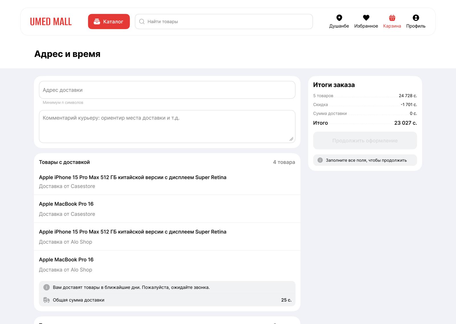
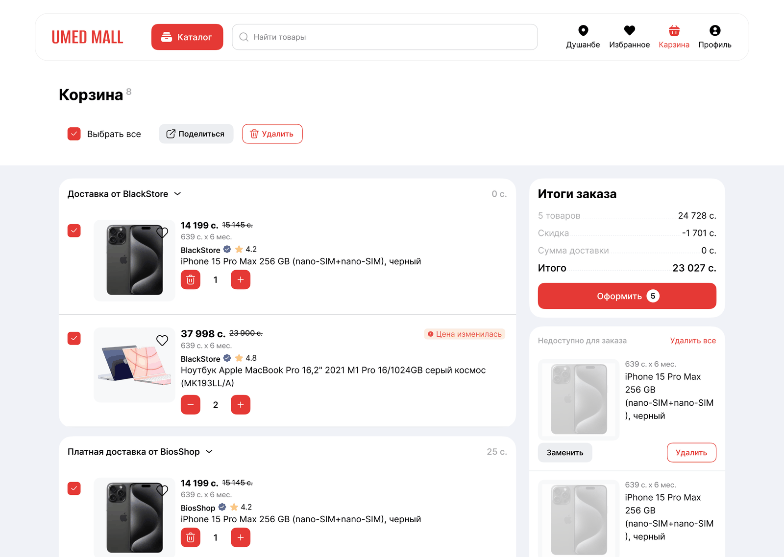
One order can cross several stores, so the cart is grouped by seller, each with its own delivery cost. Two states matter more than the happy path: “the price has changed” marked on the item rather than silently applied, and “unavailable to order” pulled into its own block with a replace button instead of quietly disappearing. Checkout then runs address → payment → done, and the continue button stays disabled until the address is real.
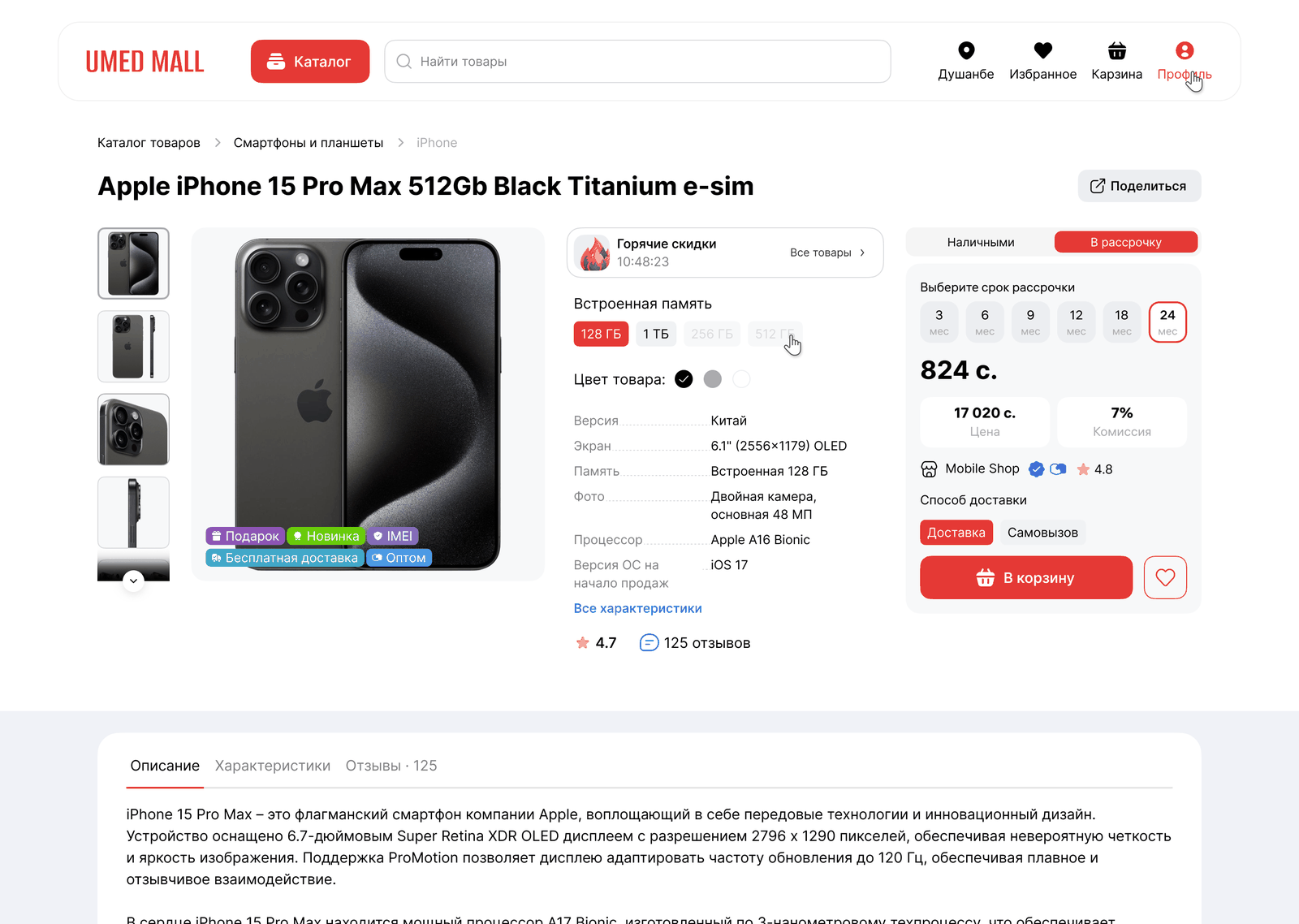
Product page
The product page: installment terms, seller rating, badges and the attribute table a shopper compares by.
Cart
The cart: grouped by seller, with a price-change warning and unavailable items separated out.
Checkout
Address and delivery: the continue button unlocks only when the form is genuinely complete.

Dark mode is a token swap, not a second palette

Colors are named for what they mean, not what they are. modeSolid-red-0 resolves to solid-red-0 in the light theme and to solid-red-100 in the dark one — one semantic name, two substitutions. Switching themes repaints nothing by hand, and a new screen inherits both themes the moment it is drawn. None of this was in the brief.
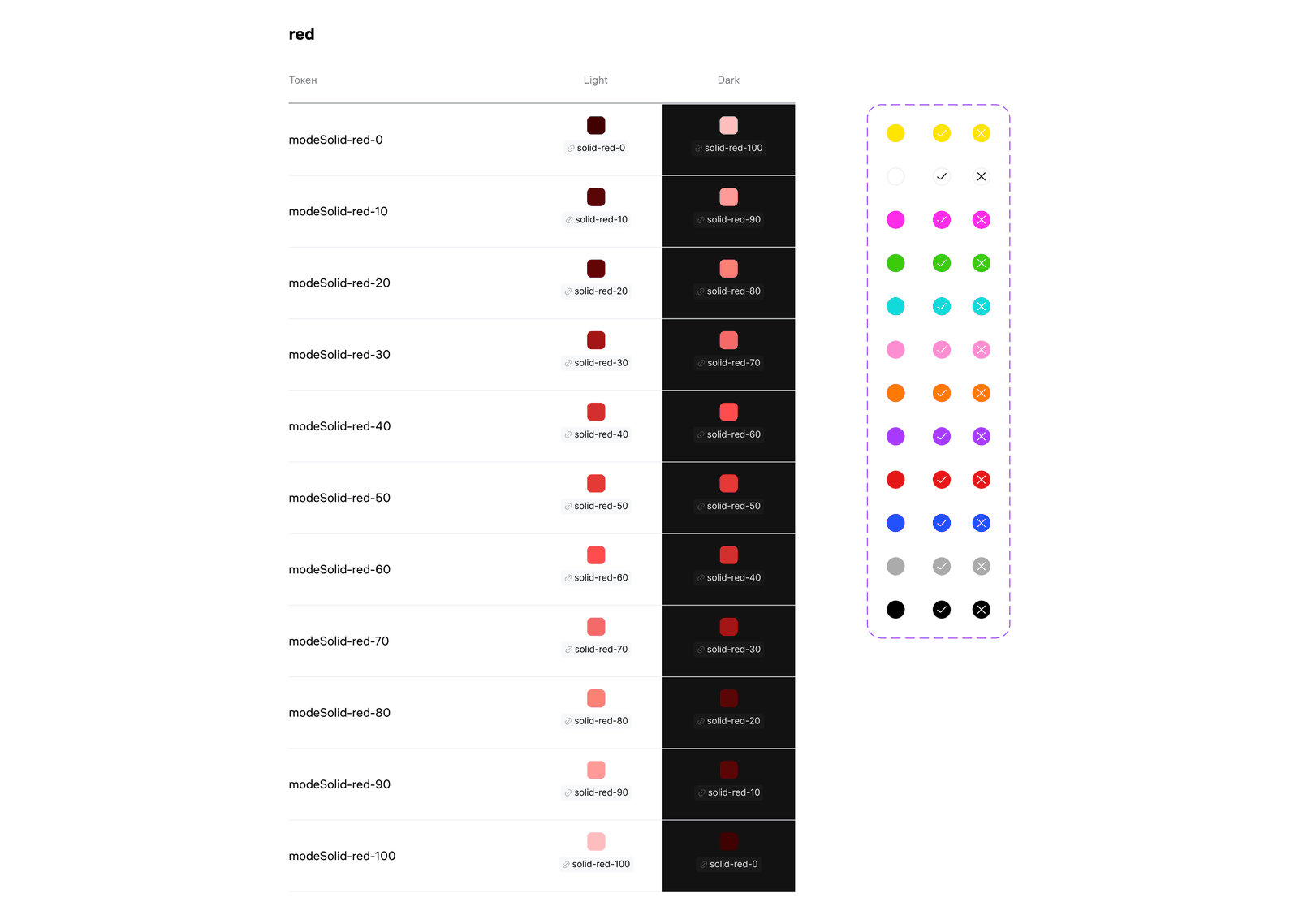
Design tokens table
The token table: semantic name on the left, its light and dark resolutions on the right.
Storefront in dark mode
The same catalog in dark mode — no separate file, no second design.

A raccoon for the moments when there's nothing to show

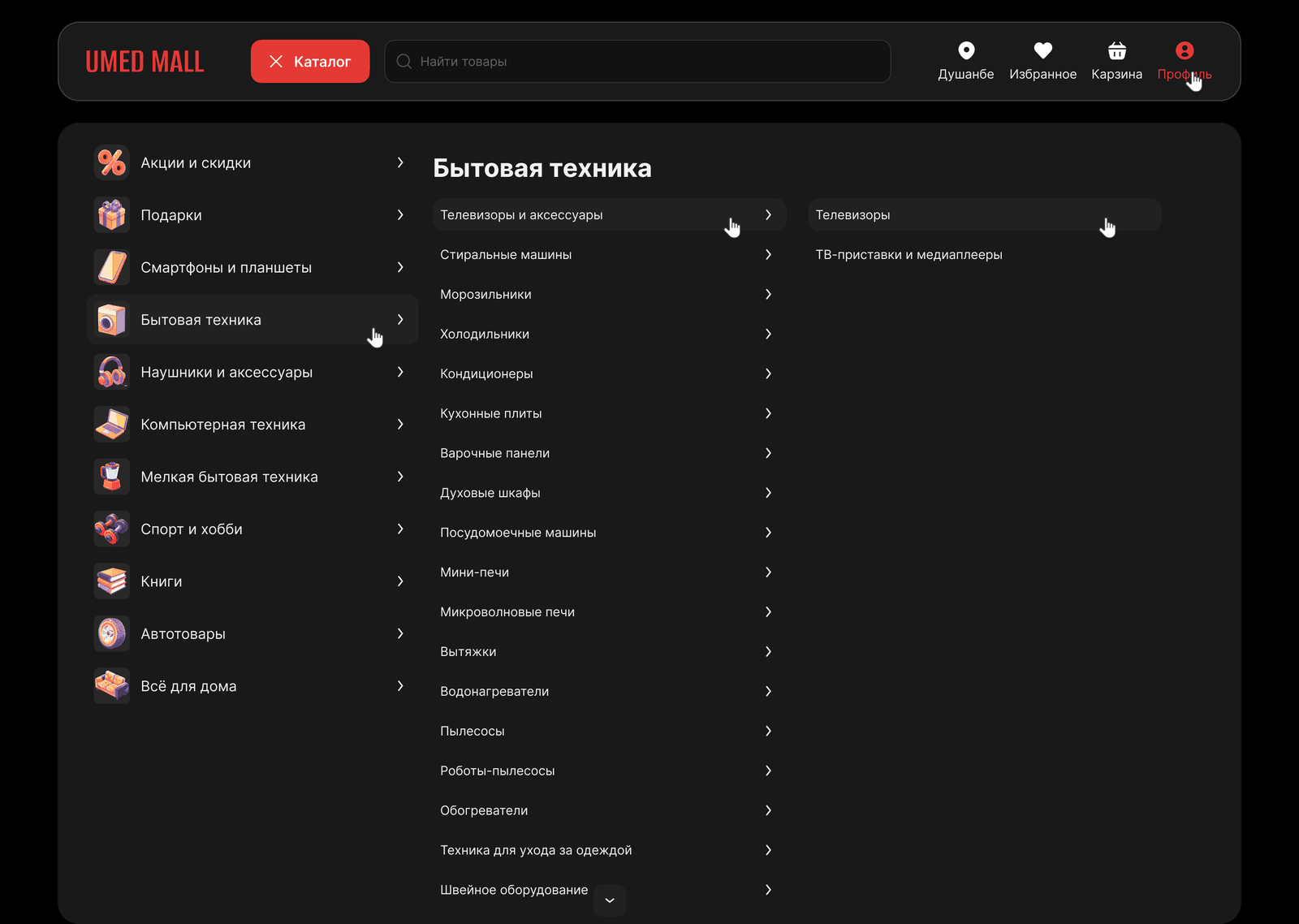
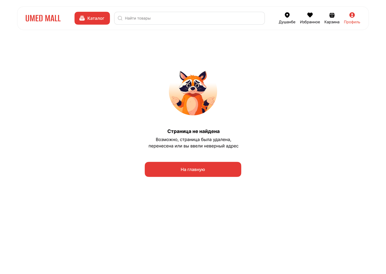
An empty cart, a 404, a 500 — the three screens no brief ever mentions and every user eventually meets. I drew a mascot for them: a raccoon in a cardboard box, in eight variations, and error pages in four versions each (desktop and mobile, light and dark). The brief said nothing about any of it. A marketplace that only looks finished when it has products in it isn't finished.

Mascot variations
The mascot in its variations — empty cart, empty search, error pages.
404 page
404: the raccoon shrugs, two lines of explanation and a single way out — back to the home page.

Every section exists twice

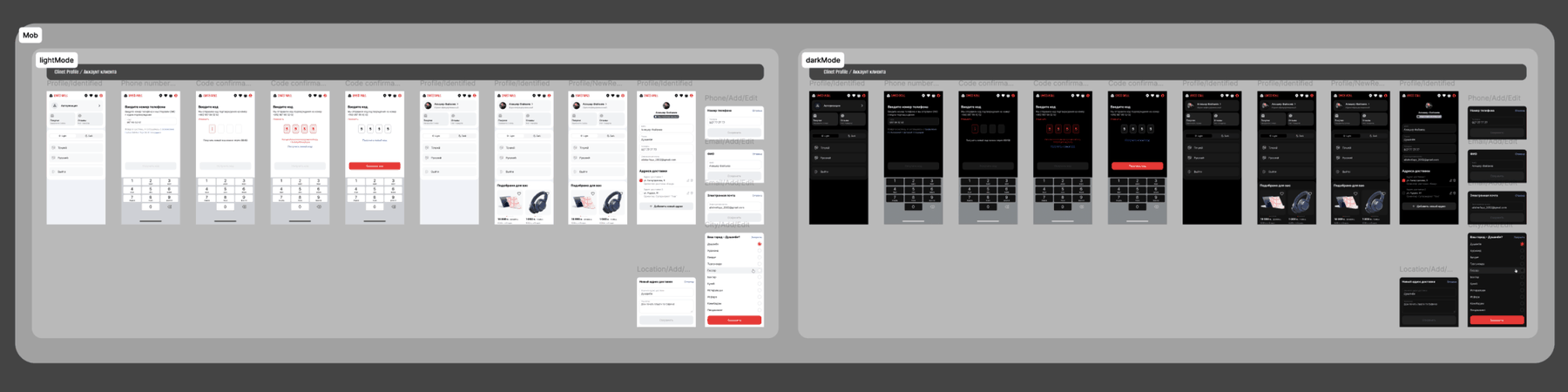
All thirteen storefront sections were delivered as desktop and mobile pairs, in both themes. Not "responsive behavior described in a comment" — drawn, so engineering never had to invent a state that wasn't there.
Client account on mobile, light and dark
The client account on mobile, laid out twice: lightMode on the left, darkMode on the right — sign-in, code entry, profile, delivery addresses, city, each screen drawn in both.

01 · Applications: three states, three destinations

Admin view

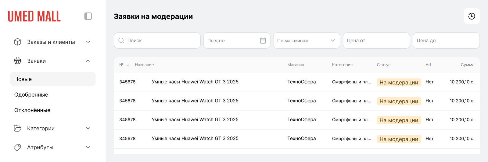
An application is a store asking for a product that is not in the shared catalog yet. New, approved and rejected live at three separate addresses in the sidebar rather than behind a status filter on one list — a moderator spends the day inside “New”, and everything on that screen is waiting on them. The decision itself is never made from the list. Opening an application shows the product exactly as a shopper would meet it — gallery, the discounted price next to the old one, the wholesale price, the seller with their rating and badges, the attribute set, the description. At the bottom sits a notes field and three ready-made reasons — photo does not match, wrong category, attribute — so a rejection rarely leaves without an explanation, and the explanation does not have to be written from scratch every time.
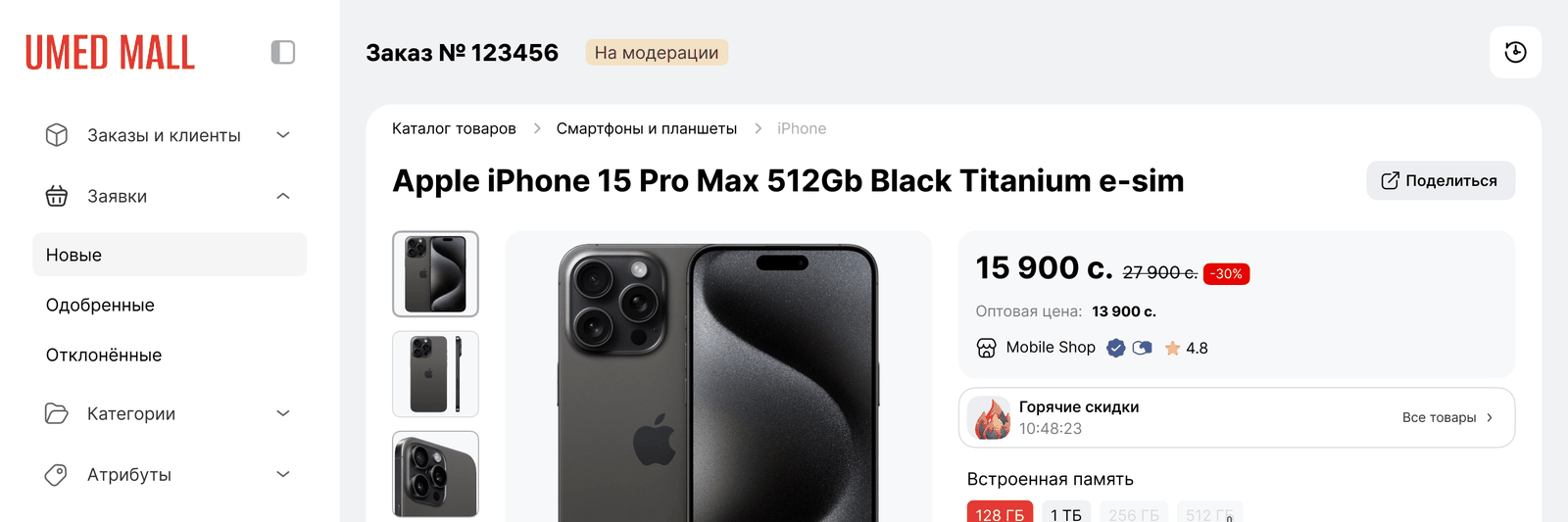
Admin — applications on moderation
“New” is open: the list of what needs a decision right now. “Approved” and “Rejected” are neighbouring items, not a filter somebody has to remember to clear.
Admin — application detail
The application opened: the product as a shopper would meet it — gallery, discount, wholesale price, seller with rating and badges.
Admin — notes and decision buttons
The bottom of the card: a notes field, three ready-made rejection reasons, and the two buttons that close the case.

02 · The attribute engine: a seller chooses, never writes

Admin view

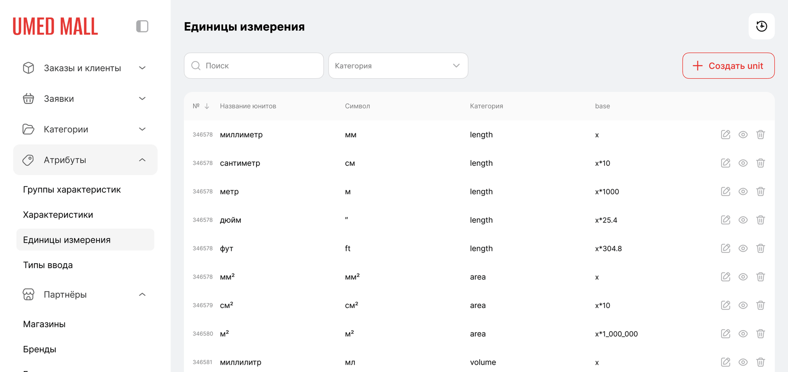
“Attributes” is four registries, not one: characteristic groups, the characteristics themselves, units of measurement and input types. The last two are where the catalog is actually decided. Input types are a fixed list of nine, each reduced to a primitive — free text, letters only, letters with digits (for article numbers and models), integer, decimal, yes/no, pick one, pick several, date. A moderator creating a characteristic does not draw a field; they pick a type, and the seller's form is assembled from it. Units each carry a category and a formula back to a base: millimeter is x, centimetre x*10, metre x*1000, inch x*25.4, foot x*304.8. One seller types inches, another centimetres; both land in the same base, so a shopper's “under 15 cm” catches both. Neither registry was in the brief.
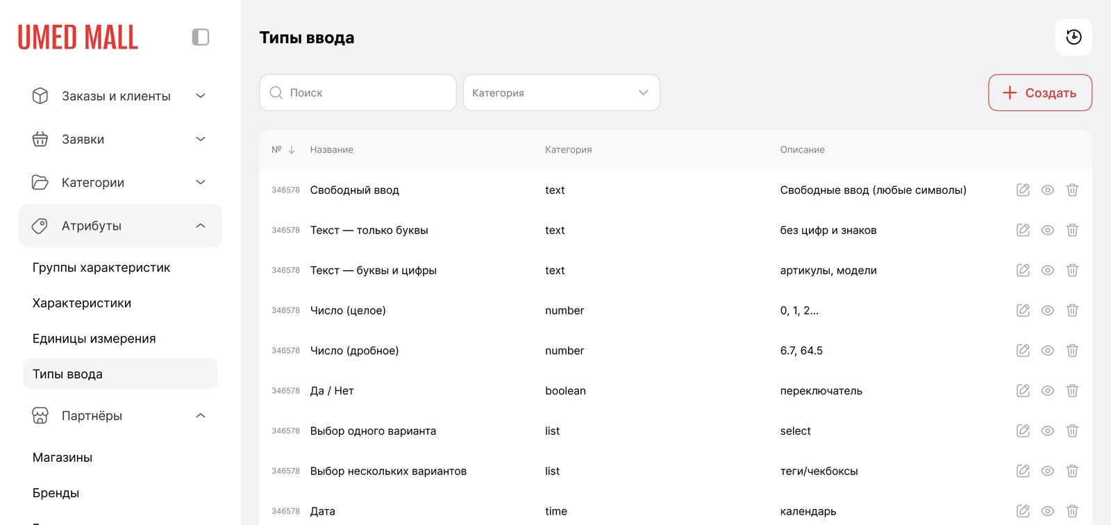
Admin — input types registry
Nine input types, each mapped to a primitive — text, number, boolean, list, time. The description column is written for the moderator, not the engineer: “article numbers, models”, “tags/checkboxes”, “calendar”.
Admin — units of measurement
Units with their conversion formula in the “base” column. Length, area and volume each have one base unit everything else resolves to.
Seller — filling product characteristics
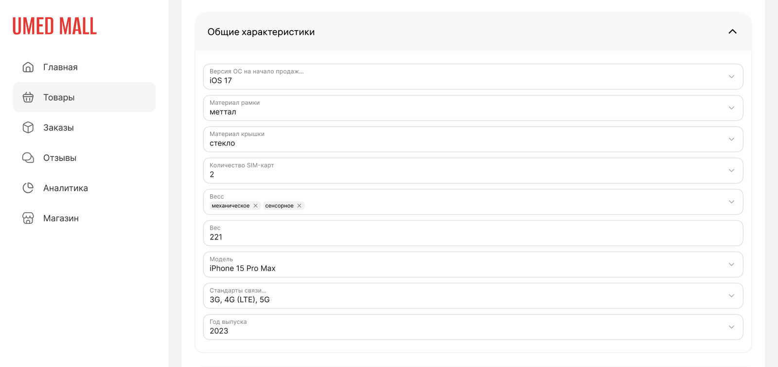
The same engine seen from the store: dropdowns where the type said “pick one”, a tag field where it said “pick several”, a plain number where it said “decimal”. The seller never invents a format.

03 · Seller dashboard — built when the spec for it did not exist

Seller view

There was no brief for the seller portal when I started it — it was going to arrive later, and it never did in time. So the home screen was built from one question: what does a shop owner need to know in the five seconds after logging in? Four tiles, and every number comes as a pair — the running total and the current month underneath it. 342 orders, 58 of them this month. An average order value of 781 somoni overall, 698 this month: the tile shows the dip without a chart. The products tile is deliberately not a boast — under “128 products” sits “18 out of date”, so the first screen of the day names a debt rather than an achievement. The store's own on/off switch sits in the header, and four buttons below repeat the routes people actually take. The month on a tile and the month in Analytics are the same figures, so a seller is never shown two versions of the truth.
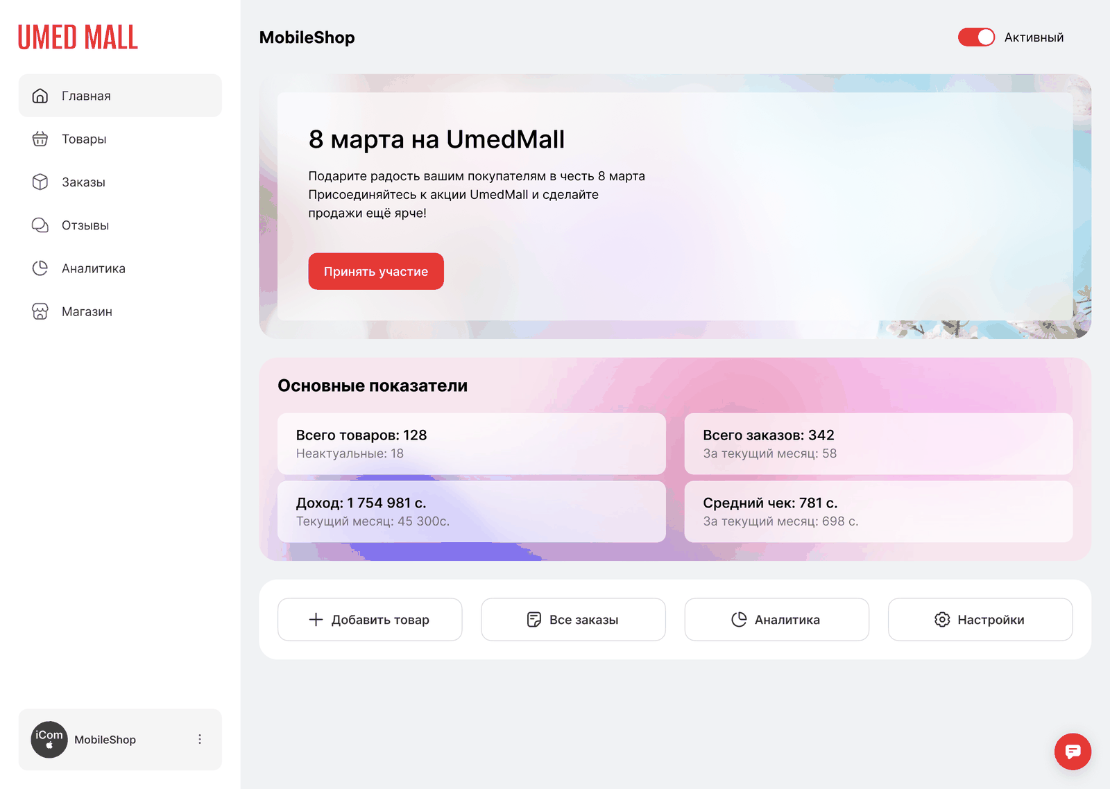
Seller portal — dashboard
The seller's home screen: the campaign invitation, four paired metrics, and the four actions that cover most of a working day.
Seller portal — analytics
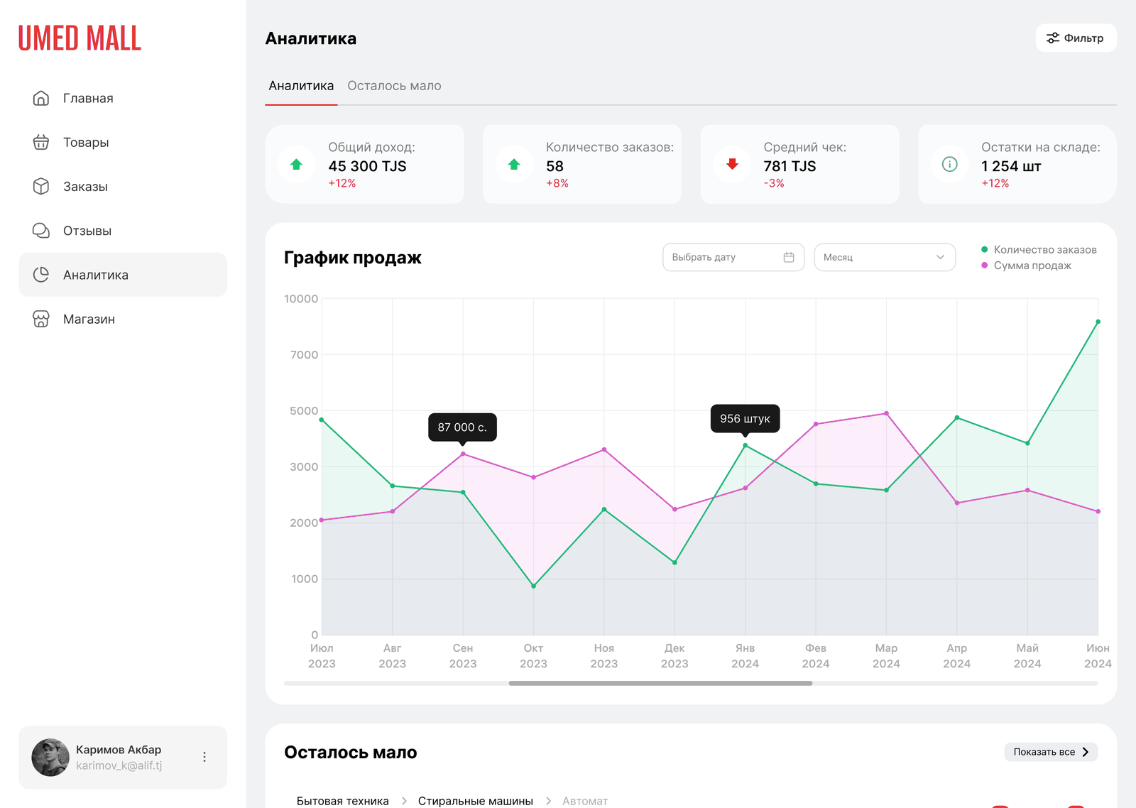
Analytics: four cards carry a delta, and only three of them carry a verdict — stock gets a neutral info mark, because more of it is neither good nor bad. Orders and sales value share one chart, so the months where the two lines cross explain the falling average order value on their own. “Running low” is a tab of equal weight, not a footnote.

04 · The seller funnel starts with one screen

Seller view

Everything above is machinery a seller only meets after signing up. This screen comes before all of it, and it has one job: turn somebody who came to UmedMall to buy something into somebody who sells here. So it promises exactly one thing and does not hedge it — you handle the products, the reach is on us.

Become a seller banner
The banner as it ships: the promise set in display type, the two sentences that qualify it, and a person already walking away with the bags.

There was no usability lab — so every screen got validated against the client's own words instead.

Without users to test on, the real validation loop was showing the client two honest versions — what I thought was right, and what they'd actually written — and merging them in the open rather than picking a winner silently.

Loop 01

Categories page

My version used a hierarchical tree with breadcrumb drill-down. The client's literal spec wanted a flat A–Z list for fast scanning. Shipped both: a flat list for moderators who need to scan everything, with breadcrumb-aware drill-down into subcategories and types underneath.

Loop 02

Banners page

My version prioritized simplicity and reuse across banner types. The client's spec demanded specific fields per banner (name required, URL optional, uncompressed image upload). Final version kept their exact field list, with the simpler interaction model underneath it.

Loop 03

Sidebar grouping

Rather than asserting "this is correct," I presented 6-group, 7-group and 9-group versions side by side with the trade-off named explicitly, and let the client choose with full context — not just a recommendation to accept or reject.

"Every merged decision got tested against one rule: would the client recognize this in their own words?" — My working rule throughout the project

Design shipped: three connected products running on one taxonomy.

NAVIGATION
19 → 7

moderator sections, collapsed from 6 flat literal-spec items into 7 named, task-based groups — none deeper than one click.

DATA INTEGRITY
0

free-text product attributes in the final schema — every value is an enum, a number with a unit, or a boolean.

SURFACES
3 → 1

interfaces — client, moderator, seller — sharing a single attribute and taxonomy engine instead of three independent data models.

Strategic outcome

A shopper can filter consistently no matter which of hundreds of sellers listed a product. A seller fills predictable, constrained forms instead of guessing what a moderator will accept. A moderator works from navigation that matches how they actually triage — not how a database happened to be named.

The marketplace is live at umedmall.tj — real stores, real listings, real orders — with the official launch still being prepared. Business metrics will be added when the client shares them; I'd rather show none than invent them.

What I'm taking with me into the next project.

What worked

  • Designing the attribute engine before the navigation. Once the data model was solid, the sidebar groupings followed almost on their own.
  • Showing trade-offs explicitly, not just a final answer. Presenting 6 vs. 7 vs. 9 sidebar groups made client sign-off faster because they felt ownership of the decision.
  • Treating "what's missing from the spec" as part of the deliverable. Units, input types, audit logs, cities and brands were never asked for — I added them because the product needed them, not because scope allowed it.

What I'd do differently

  • Get all three specs on day one. Receiving client, moderator and seller requirements in sequence meant revisiting IA decisions each time a new document arrived.
  • Lock the attribute/unit taxonomy before touching any screen. I designed individual pages first and had to retrofit the data model once edge cases like temperature surfaced.
  • Write the terminology glossary earlier. "Заявки" vs. "Заказы" vs. "Магазины" got renamed and re-grouped for weeks before the names settled — a glossary in week one would have saved that churn.

See it running, or open the file

The marketplace is live, and the complete Figma file — storefront, moderator console and seller portal on one taxonomy — is open to view.

→ Open the live marketplace → The full Figma file (all three surfaces)