All work
Case Study · 2026

Alif Tech
Connect

Rebuilding smsgate.tj — the largest SMS platform in Tajikistan — into a multichannel communication infrastructure, and renaming it so it can leave the country.

Role
Sole Product Designer
Duration
~3 months
Status
In development
Company
Alif Technology · ATC

One product owned the SMS market in Tajikistan. Then the market began to leave.

smsgate.tj is the largest SMS-distribution platform in Tajikistan, processing 2.4M+ messages per month for banks, retailers, and government agencies. The product was built when SMS was the only channel that mattered. By 2025, every competitor was offering Email, Telegram, WhatsApp — and our customers were starting to listen.

The leadership decision was strategic: don't just patch SMS, evolve the whole platform. Add Email and Telegram now, prepare the architecture for WhatsApp and Push next year, and design something we could take to Uzbekistan, Kyrgyzstan, and Kazakhstan — markets where Tajik-centric "SMS gateway" branding would never sell.

I was brought in as the sole designer to lead this transformation: research, IA, interaction, visual system, and Figma-to-dev handoff — all of it.

11
client portal sections
23
admin sections
~170
Figma frames in the admin file
3 → 5
channels (SMS·Email·TG → +WhatsApp·Push)

The product was tied to one channel — but the customer's job was never about channels.

Business reality

Alif Tech wanted to expand beyond Tajikistan into Uzbekistan, Kazakhstan and Kyrgyzstan. The brand "smsgate.tj" wouldn't travel — the SMS-only positioning was capping growth, and clients (especially banks) were starting to pilot competitor platforms that offered all channels in one place.

Three forces were pressing at the same time:

  • Market saturation in Tajikistan — SMS volume per active client had flatlined for 6 months.
  • Bank clients piloting Edna.ru and similar platforms to consolidate channels.
  • Strategic expansion vision — leadership wanted a product whose name and architecture worked outside one country.

User reality

The current admin tool was built like an internal Excel replacement: usable by the team who built it, hostile to anyone else. There was no real customer self-service — every new template, every new sender ID, every campaign was emailed to a support engineer and configured by hand.

What I heard repeatedly in interviews:

"I want to send the same offer to all my clients — by SMS to those without a smartphone, by Telegram to subscribers, by Email to everyone with a verified address. Right now I have to create three separate campaigns and reconcile them manually."

— Marketing manager, mid-size Tajik bank

To redesign for new channels, I had to first unlearn what "SMS gateway" meant to everyone.

The research had to do two things at once: ground the redesign in current pain points, and stretch the imagination toward channels nobody on the team had ever shipped before.

Method 01

1-on-1 interviews

7 interviews — 3 with internal smsgate.tj staff (moderation, support, integration), 4 with marketers and analysts at customer organizations (Alif Bank, Alif Mobi, AlifShop, 365 Trends). 45–60 minutes each, focused on a recent real campaign they ran.

Method 02

Competitive audit

Deep dive into Edna.ru (the Russian incumbent in multichannel), plus reference looks at Sendsay and Mindbox. Mapped Edna's IA — Справочники → Маршрутизация → Шаблоны → Рассылки → Отчёты — and used it as a structural reference, not a visual one.

Method 03

UI audit & heuristic eval

Walked through the existing smsgate.tj admin section by section. 38 documented issues across navigation, terminology, empty states, error messaging, and information architecture.

Method 04

Support ticket analysis

90 days of support tickets pulled and clustered. 62% were "configure this for me" requests — tasks that the UI technically supported, but nobody could complete on their own. Massive signal.

Key user insights

Insight 01

Marketers think in campaigns, not channels

"I want to wish my clients a happy New Year" — that's the unit of thought. Choosing SMS vs Telegram is a downstream optimization, not the starting point.

Insight 02

Admins live inside one screen all day

Internal smsgate.tj operators don't browse — they reload one dashboard, scan for incidents, and triage. Dashboard density matters more than discoverability for them.

Insight 03

Devs want APIs that don't change

Existing integrations have a stable /sms endpoint. Adding new channels via a new channel parameter (not new endpoints) means clients adopt Email/Telegram without code changes.

"We aren't adding two more channels to an SMS product. We're rebuilding an SMS product into a communication platform that happens to start with three channels." — My re-framing of the brief, after the 4th interview

The brief was "add Email and Telegram". The problem statement I anchored the work to was bigger.

Problem statement

smsgate.tj's current architecture treats SMS as the product. Email and Telegram can't be bolted on without breaking either the data model or the user's mental model. Our customers think in campaigns, audiences and outcomes — not in channels.

We need a platform that lets a marketer launch a campaign, choose channels (or let a cascade choose for them), and see one unified result — while keeping the admin team in control of who can send what, from where, to whom.

Goals

  • Unify sender, template, audience and report under one mental model — channel-agnostic.
  • Enable customer self-service so support tickets drop and onboarding scales.
  • Design for the next 5 channels, not just the next 2. WhatsApp, Push, and whatever comes after.
  • White-label the client portal so the same product can be sold under partner brands.

Success metrics

Customer self-service rate

% of campaigns started by the customer without contacting support. Target: 75%+ within 6 months of launch (baseline: ~12%).

Channel mix shift

Reduce SMS share of total messages from ~92% to 60% as Email/Telegram pick up the volume. SMS becomes the fallback, not the default.

Time to first send

For new client organizations: from sign-up to first delivered campaign in < 2 hours (currently 2–7 days because of manual onboarding).

The decisions I'm most proud of are the ones I almost made the wrong way.

I'll walk through the four design decisions that shaped the product more than any pixel — including one alternative I worked on for two days before throwing it out.

1

Generalize "Альфанумерик" into "Sender" (Подпись)

The legacy product had a section called Альфанумерик — SMS sender IDs. With three channels, I could have made three lists. Instead I introduced a single Подпись (Sender) concept that polymorphs by channel: alphanumeric for SMS, "Name <email@domain>" for Email, a bot username for Telegram. Same moderation workflow, same approval state machine, same UI shell. This single decision collapsed three would-be sections into one and made WhatsApp/Push trivial to add later.

2

Build a cascade — even though Email and Telegram alone would have shipped sooner

The killer feature in Edna is the cascade: "try Telegram first, fall back to Email after 15s, fall back to SMS after another 30s." For OTP and transactional flows it cuts SMS cost dramatically without hurting delivery. I pushed for shipping the cascade in v1 because half the value of multichannel is the cascade. Without it, customers just pick the cheapest channel and the platform doesn't earn its keep.

3

Two interfaces, one model: Admin vs Client

Through interviews it became obvious that internal admins and customer marketers don't share a problem. Admins moderate, configure shared infrastructure (gateways, anti-pumping rules), and resolve incidents. Marketers create audiences and campaigns. I designed two completely separate IAs on top of the same data model — Admin (23 sections, dense, table-heavy) and the client portal (11 sections, task-flow first, and deliberately lighter).

4

Designed a wizard-only flow — then deleted it

For two days I explored a "guided" experience where every creation flow was a wizard: pick channel → pick audience → pick template → review → send. It tested badly with the experienced operators we interviewed. They didn't want narration — they wanted a form. I kept the wizard ONLY for two genuinely complex flows (audience builder, campaign creation) where the user's mental model is sequential, and made everything else a single full-page form. This is the deletion I'm proudest of — the one that didn't ship.

5

Rename the product — because "SMS gateway" cannot cross a border

The name smsgate.tj pins the product to one channel and one country, and both were about to stop being true. I proposed Alif Tech Connect: a name that survives Email, Telegram, WhatsApp and Push, and survives Tashkent and Almaty. With it came a separate identity — indigo #4F46E5, deliberately not the green of Alif Bank, because ATC is a company inside the group rather than the bank itself. Renaming a product nobody has trouble finding is a hard sell; the argument that landed was that every month of delay makes the migration more expensive.

The system, screen by screen.

The visual system follows a tight design-token model in Figma — one accent (#4F46E5), one neutral scale, semantic status colors, and a strict pill/card geometry (12 / 16 / 999px radii). Below are the screens that carry the most product weight.

01 · Admin dashboard

Admin view

An operator opens this and sees one organization: contract number in the header, volume this month, and the price tier it has climbed to. The tariff ladder is the part I am most pleased with — five steps from 0.50 down to 0.15 TJS, with “you are here” marking the current one and a line underneath doing the arithmetic nobody does on their own: “send another 51,770 SMS this month and the price drops to 0.22 — at your volume that is about 4,100 TJS saved”. A pricing table becomes a reason to consolidate traffic here instead of splitting it across vendors. Notifications are ranked, not listed — CRITICAL for a failing SMTP handshake, ATTENTION for a sender stuck in moderation for two days, INFO for a tariff change next month. And the channel strip at the bottom — 70% SMS, 18% Telegram, 12% Email — is the entire project measured in one widget.
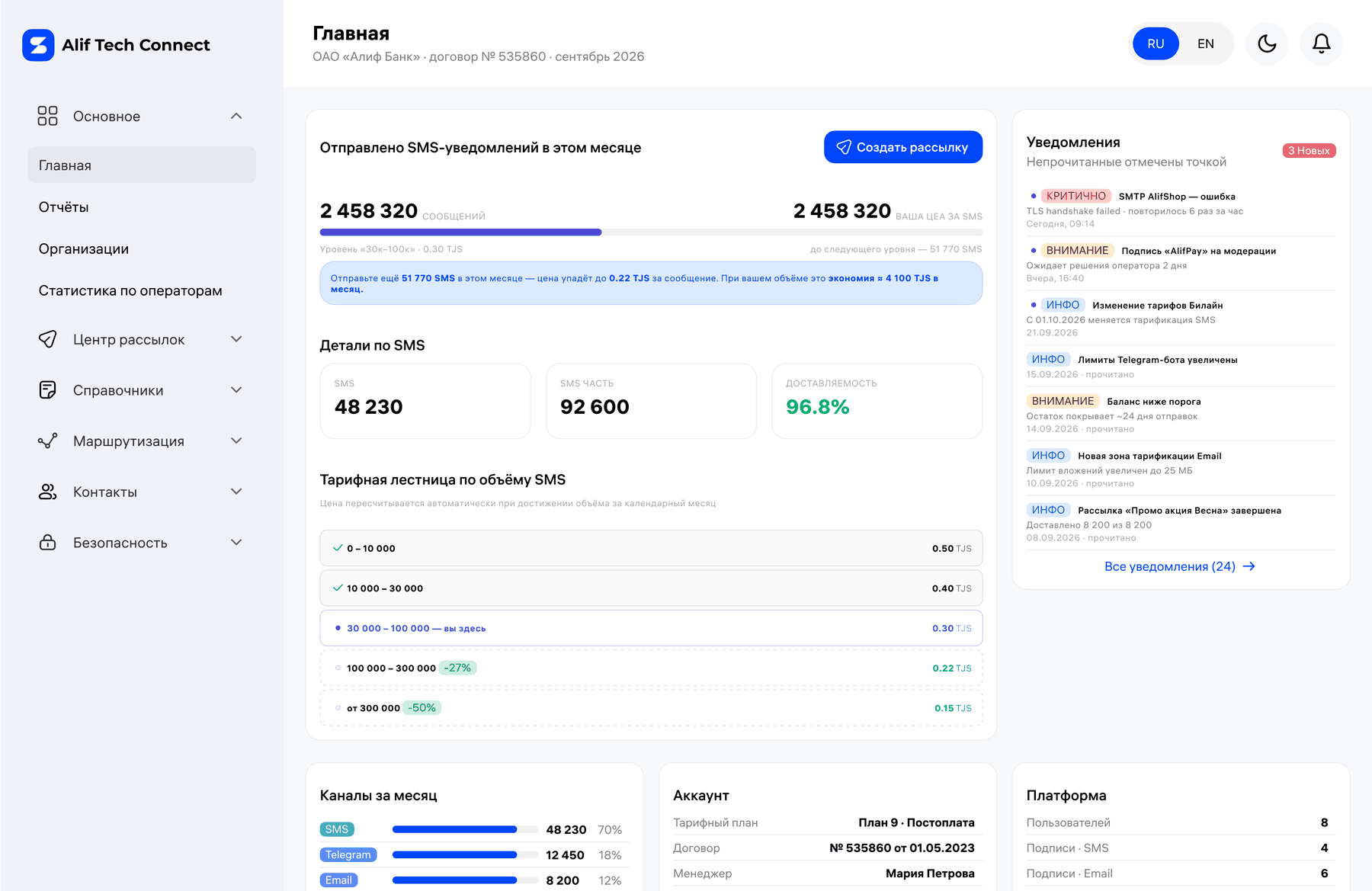
Alif Tech Connect admin dashboard
The admin looking at one organization: contract number in the header, this month’s volume, the price tier it has reached, and the channel split — 70% SMS, 18% Telegram, 12% Email. That split is the whole project in one widget.

02 · The channel chip — a tiny component carrying the whole product story

A solid pill in the channel's own color, white text. It appears in tables (rows of broadcasts, journal entries), in audiences, in templates, in dashboards. Designing this component first meant every other surface could be built with it. WhatsApp and Push are baked in at the token level and drawn alongside the rest — turning them on needs no redesign. The chip also carries a sender count, so it reports which channel and how many you have configured at once: a status, not a label.

Channel chips
The same component across five channels. Three live, two reserved — and the badge shows how many senders each one has, so the chip is a status, not a label.

03 · Cascade builder — visual logic, not a JSON editor

A vertical drag-and-drop list of stages. Each stage is one channel + sender + template + timeout + transition condition. The total timeout computes itself and sits in the corner: Telegram waits 15 seconds, Email 30, then SMS — 5 minutes 30 seconds worst case. The user sees that number before launching, instead of learning it from a report. The user-facing model is "this then this then this if not delivered" — never "edit JSON."
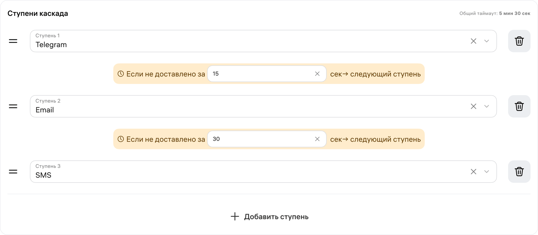
Cascade builder
Three stages, each a channel with its own timeout, and the total printed in the corner — 5 min 30 sec. Drag the handle to reorder; the arithmetic updates itself.

04 · Client portal — same engine, a different set of permissions

Client view

When a customer logs in they see 11 sections: Dashboard, Channels, Contact Groups, Audiences, Templates, Broadcasts, Quick Send, Journal, Reports, Profile, API & Docs. What makes it a different product from the admin is what it withholds: the customer sees their gateways but cannot connect one, and the screen says so in plain words instead of hiding a disabled button. In exchange they get everything the admin has no business owning — their own balance with “enough for ~14 days”, a spend forecast, contact import by file, an audience builder with AND filters and exclusions, and an API section with cURL examples so their developer never has to file a ticket.

Before · one interface for everyone

62%

of support tickets were “configure this for me” — tasks the UI technically allowed, done by an engineer because nobody else could get through them.

After · two interfaces, one model

11 + 23

sections, split by who owns the job. The customer runs campaigns without asking; the platform keeps gateways, moderation and anti-fraud, because those were never the customer’s to run.

05 · Bilingual from day one — not an afterthought

Every label, every error, every empty state was authored in RU and EN simultaneously inside Figma and the prototype. The pill switcher in the topbar isn't decoration — it actually retranslates the whole UI. The reason: this product is going to Uzbekistan and Kazakhstan in 2026/27. If i18n waits until then, it's a full re-architecture. Doing it now costs days; doing it later would cost months.

RU

Создать рассылку · Выберите канал · Аудитория готова · Доставлено 96.8%

EN

Create broadcast · Choose channel · Audience ready · Delivered 96.8%

I had to build conviction without production data — so I borrowed it from real users, in three loops.

Loop 01

Stakeholder demo sessions

Weekly demos to PM, head of product, and CEO. Iterated on terminology (“Канал” on its own read ambiguously, so it ships with a clarifying subtitle), navigation depth, and which features were P0 vs P2. Lost two debates I'm glad I lost (single-org vs multi-org switch lives in the sidebar, not the topbar).

Loop 02

Usability tests · 8 users

5 marketers + 3 internal admins. Task-based: "create a campaign", "block a phone number", "find out why a specific message didn't deliver". Two findings broke significant assumptions and led to the cascade builder being rebuilt from horizontal flow to vertical stack.

Loop 03

Engineering feasibility review

Reviewed every novel interaction (drag-and-drop cascade, real-time progress on broadcasts, audience preview as you build) with the backend lead. Cut two interactions, kept the rest, scoped a "phase 1.5" for real-time progress to avoid blocking the release.

"Two of our marketers found the audience builder so much faster than the current tool that they asked when they could start using it for real campaigns. That's the validation I cared about." — After usability test session 4

The product launches in Q4 2026. Here is what we expect to move — and how I'll know if the design did its job.

CHANNEL MIX
−32pp

drop in SMS share of total messages (from 92% to ~60%) as Email and Telegram pick up commodity traffic. SMS becomes the fallback channel, not the default.

UNIT ECONOMICS
−45%

expected cost per delivered message for cascade users (OTP especially). Bigger margin per customer = budget for the next market.

SUPPORT LOAD
−60%

target reduction in "configure this for me" support tickets. The client portal replaces 62% of current ticket categories with self-service.

Strategic outcome

The platform stops being "the Tajik SMS gateway" and becomes a regional communication infrastructure. From here the brand can be deployed as alif business inside the Alif group, white-labeled for a partner in Tashkent, and sold direct to mid-market banks across the CIS — but that is the next step: in the current screens the customer still sees the platform’s own brand. The architecture supports WhatsApp and Push in 2027 without a redesign.

What I'm taking with me into the next project.

What worked

  • Generalizing before specifying. The single "Sender" abstraction (replacing SMS-specific "Альфанумерик") collapsed three sections into one and made future channels free.
  • Designing the chip first. The channel pill drove the rest of the system. Once it existed, the dashboard, journal, audience, broadcast, and report screens all just used it.
  • Two separate IAs (Admin / Client) on one data model. Trying to use one navigation for both would have made everything 30% worse for everyone.

What I'd do differently

  • Test the cascade earlier. I tested it in usability round 2 and had to rebuild it from horizontal to vertical. If I'd shown a paper sketch in week 1, I would have saved myself three days.
  • Define the i18n word list before designing. I kept tweaking labels per screen (“Рассылка” (Mailing) vs “Кампания” (Campaign) vs “Отправка” (Send)). A glossary in week 1 would have saved a week of micro-rewrites in week 5.
  • Get a real customer in the kickoff. Three of my insights came from interviews with bank marketers. I could have done those in week 1 instead of week 2 and avoided one wrong-direction prototype.

Want to see the rest of the system?

The Figma file covers both circuits — 23 admin sections and 11 in the client portal, the cascade builder, the sender moderation queue and the reports, in light and dark.

Under NDA. Full screens and Figma walkthrough available on request. dsgnorion@gmail.com

→ All case studies