UX/UI · 2022 → live on Google Play · Orion Muhamadiev
Payvand App
Two products that solved two different problems in Tajikistan's money transfer economy — one for domestic payments, one for frictionless remittances from Russia — tied together by a single design system.
Role
UX/UI Designer
Year
2022
Type
Shipped · iOS & Android
Apps
Payvand Wallet + Payvand Transfers
Payvand Wallet · everyday money
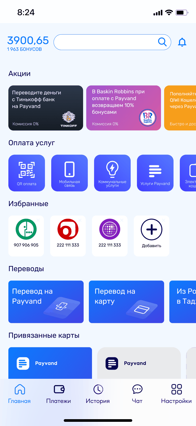
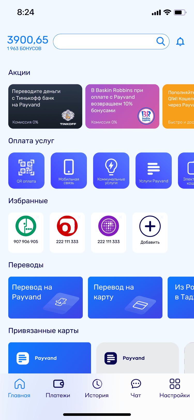
Balance, bonuses, promotions, services with QR first, favorites, transfers, linked cards — one screen that has to hold a whole bank.
VS
Payvand Transfers · one job
Four corridors and nothing else. The same company, the same brand, and a deliberate refusal to bring anything from the screen on the left into it.
Project Overview
One design system. Two apps built for two completely different people.
Payvand Group MDO is a micro-deposit organization in Tajikistan — licensed by the National Bank in October 2021, already running more than 3,000 payment terminals and 7,000 collection points, and moving from that cash network toward digital banking. The brief was “design a mobile app”. The market said there were two separate problems, and one app would have solved neither.
The result: Payvand Wallet for registered users doing everyday domestic banking, and Payvand Transfers for migrant workers in Russia who just need to get money home tonight — no account required. One shared component library keeps them recognizably the same company.
27,8%
of Tajikistan’s GDP came from remittances in 2021 — World Bank
$1,79 млрд
sent from Russia to Tajikistan in 2021 — Central Bank of Russia
$128
average transfer in 2021 — Central Bank of Russia
3 000+
payment terminals Payvand already ran across the country
The Problem
The competitor had already split its products. We had to answer that, not out-feature it.
The remittance gap
Labour migrants from Tajikistan working in Russia needed to send money home regularly. Most were not tech-savvy. The app they chose — Favri Intiqol, Kommertsbank Tajikistan’s remittance-only app, separate from its Favri mobile bank — won not by being feature-rich, but by asking almost nothing of them.
Kommertsbank Tajikistan did not try to serve them from its main banking app. It shipped Favri Intiqol as a separate product doing one job: money from a Russian card to a phone number or a Korti Milli card, zero commission, nothing else on screen. Everyone else — apps asking for an account, an ID check, a multi-step onboarding — watched those transfers go elsewhere.
“A competitor who ships a second, emptier app is telling you what the job actually is.”— My read of the competitive teardown, 2022
The domestic payments problem
Inside Tajikistan, NFC acceptance was barely deployed. Going through the local banking apps turned up the same complexity people already struggled with, and Alif Mobi had set the habit everyone else was measured against.
Payvand needed to compete with that habit without just copying it. The insight: go where Alif hasn't — introduce QR payment as the country's primary cashless alternative to NFC, and build favorites/templates for the recurring bills people pay every month.
QR payment (no NFC)Favorites / templatesZero-registration flowRussia → Tajikistan6-step transferPayvand UI library
Research
The data said "one app." The users said "two different people."
I used Alif Mobi as the primary design reference — not to copy it, but because users already had muscle memory for it. Understanding exactly what they relied on there, and what they found frustrating, shaped every navigation decision.
Method 01
Competitive teardown
Mapped Alif Mobi feature by feature — what worked, where the friction sat, which habits users had already formed. Then laid Favri Intiqol over it to see why it was winning remittances: fewer screens, no account required, card in, card out.
Method 02
Market data analysis
Central Bank of Russia figures set the scale: $1.79B sent from Russia to Tajikistan in 2021, at an average of $128 per transfer. The World Bank put remittances at 27.8% of Tajikistan’s GDP that year. Numbers this size make the case on their own — a market this large, served by apps this hard to use.
Method 03
A Telegram room that grew by one owner at a time
Not user research — I want to be precise about that. When the project started we opened a Telegram group and added people to it only as questions came up: whoever owned the answer got pulled in. Over time the room became the project’s institutional memory, and polls inside it settled the questions no single person could. It is the closest thing to a spec this project ever had.
A note on data
The number that wanted to be the headline — and why it isn’t
Payvand’s team ran their own research and shared it with everyone working on the app. A market share for Favri Intiqol appeared in it: roughly 49% of Russia→Tajikistan transfers. It is not in this case study, and the reason matters more than the number.
Tajikistan publishes almost nothing. Companies do not disclose turnover — partly so the tax authority has less to ask about — and per-app industry statistics do not exist in any open form. So an internal figure here is unverifiable by construction: not because anyone lied, but because there is nothing to check it against.
Hence the rule this case is built on. Only numbers you can open in a link sit in the headlines — Central Bank of Russia, World Bank, the app stores. Internal estimates informed the work; they are not presented as fact.
And the two-app decision never rested on that 49% anyway. It rested on something anyone can still see: Kommertsbank had already moved remittances into an app of its own. An argument that needs a number you cannot show is a weak argument.
Key insights
Insight 01
Simplicity is a feature, not an absence of features
Favri Intiqol was not being chosen over richer apps. It was being chosen over apps people could not get through. Simplicity was the entire product.
Insight 02
Registration is a conversion killer for remittances
A migrant worker sending $128 home doesn’t want to create an account. They want to type a card number, verify the amount, and be done. Every extra step loses them.
Insight 03
QR is the viable cashless path in Tajikistan
NFC terminal penetration was near zero. QR codes, already deployed by merchants as static per-merchant codes, were the only realistic path to domestic cashless adoption.
The Strategy
Split into two products. Accept the cost of two apps to avoid the cost of one bad one.
The core decision
Putting both user groups in one app would mean compromising both experiences. A registered domestic user needs depth — balance, services, history, transfers, cards. A migrant remittance sender needs one thing: to get money to their family with as few barriers as possible.
One design system (Payvand UI) would ensure visual coherence and brand recognition across both apps, so they still felt like the same company — without forcing users who want simplicity to navigate complexity they'll never use.
What each app needed to be
Payvand Transfers
Zero-registration path
Card in, card out — 6 steps, no account
Russia → Tajikistan, Uzbekistan
No feature noise
Payvand Wallet
Full account features
QR, utilities, transfers, cards
Favorites & templates
Favorites and saved recipients
Design goals
6 steps, no account
Payvand Transfers: direction → recipient and amount → card → confirm → SMS → done. Never ask for registration on the critical path.
QR as the cashless habit
Establish QR payment as Tajikistan's primary cashless method — build the habit before the infrastructure catches up.
One UI library, two apps
Payvand UI — cards, buttons, icons, type — applied consistently so both apps feel like Payvand, even though they serve different users.
Process
The four decisions that shaped both products.
Each of these was a direct response to something specific in the research — not a "best practice" applied generically, but a direct answer to a real user problem that the data had named.
1
Six steps, no account — and registration as a feature, not a gate
Payvand Transfers’ flow was designed to be completable without ever creating an account. Direction → recipient and amount → the card being charged → confirm → SMS code → delivered. Six steps, then done. Registration unlocks history and repeat-transfer features — a positive pull, not a mandatory barrier. This was the direct design response to why Favri was winning.
2
QR as the primary payment method — designing around the infrastructure gap
Rather than waiting for NFC terminals to proliferate, I designed QR payment as the first and most prominent service in Payvand Wallet. In Tajikistan's existing merchant landscape, static QR codes per merchant were already the norm — customers enter the amount themselves. The design worked with that behavior rather than against it, and added favorites for the merchants people return to every week.
3
A shared component library, because there was nothing to inherit
Cards, typography, icon set, color tokens, button hierarchy — all built once and applied to both apps. A user who installs both apps recognizes the family instantly. The design system also solved the handoff problem: developers got one source of truth for both products, reducing inconsistency in implementation.
Design
Key screens and the reasoning behind each.
01 · Six steps — parity, not victory
Payvand Transfers
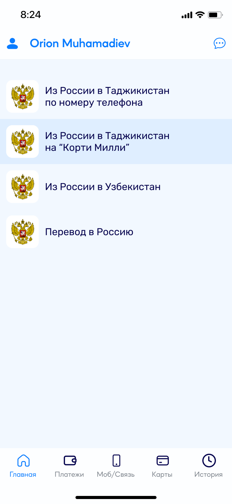
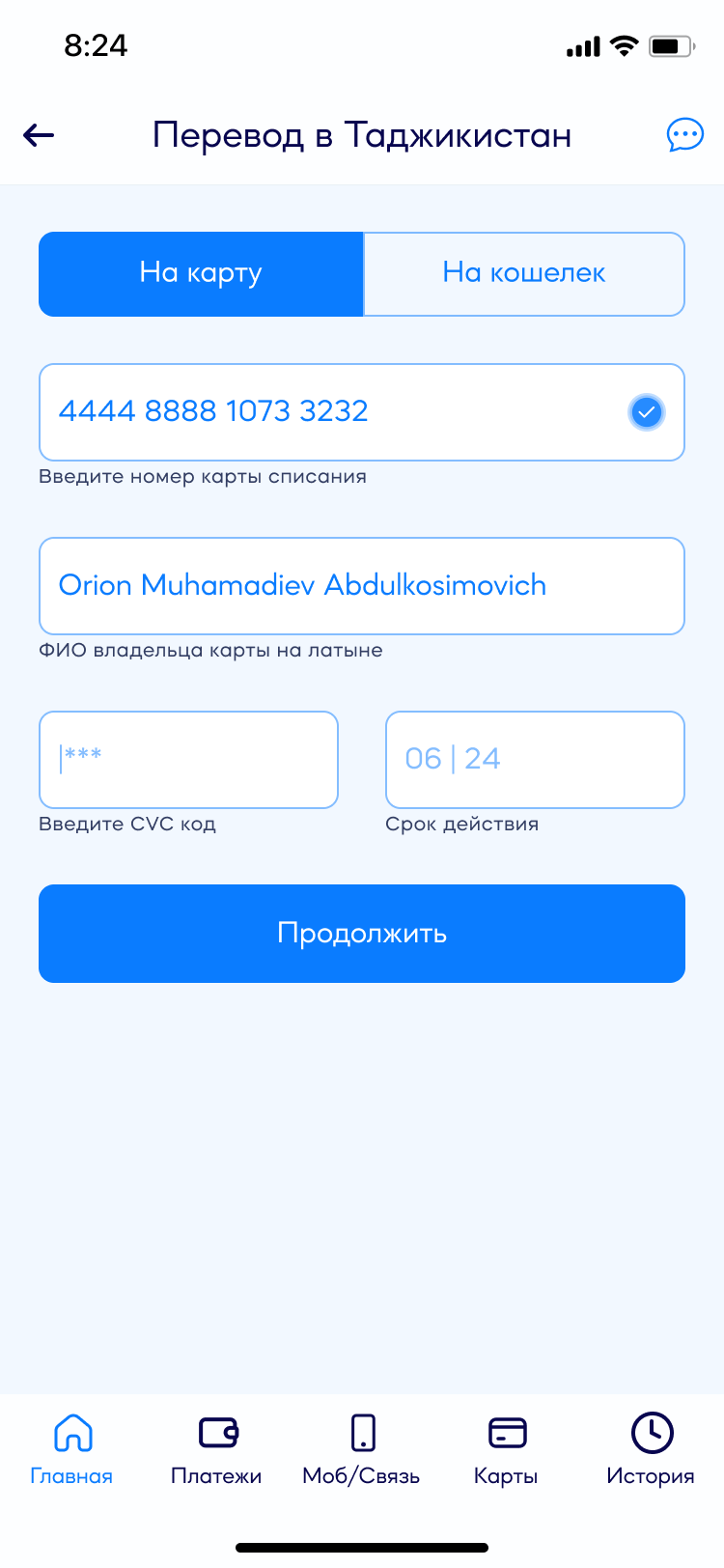
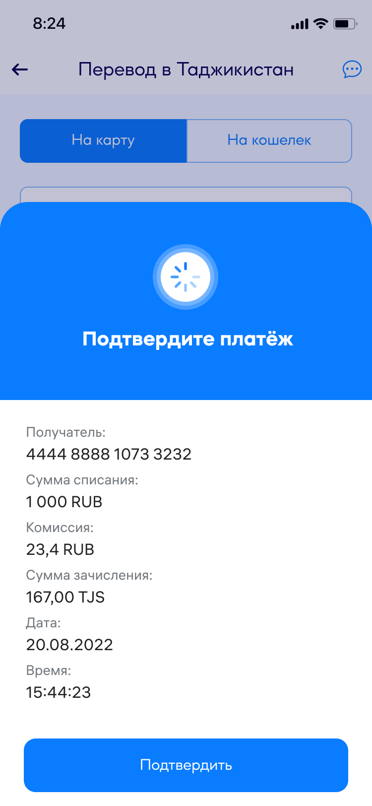
Corridor, recipient and amount, the card being charged, confirmation, the SMS code, done. Six steps, and registration is never asked for on the critical path. To be straight about it: this does not beat Favri Intiqol — it draws level with it. That was the point. On a flow this short there is nothing to win on cleverness; you either clear the same bar or you lose the person at step three. Being worse was the only outcome we could not afford.
1
Direction
2
Recipient and amount
3
The card being charged
6
Confirm the details
5
SMS code
6
Delivered
↳ The recipient field validates as you type — “Клиент найден!” (Client found!) appears before you commit to anything, so a wrong digit costs a second, not a transfer.
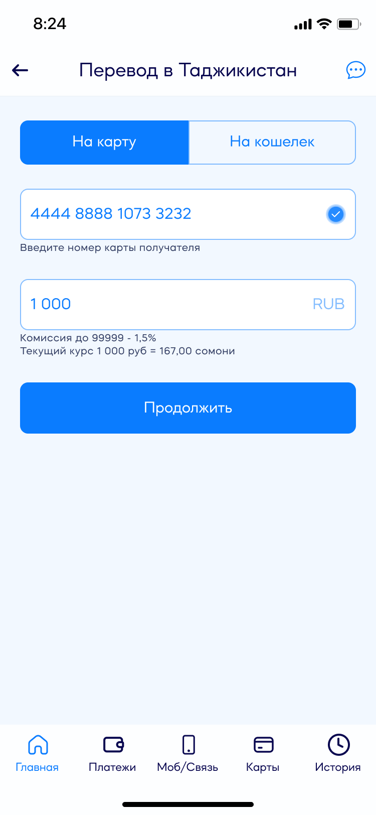
Choosing a corridor: Russia → Tajikistan by phone number or to a Korti Milli card, Russia → Uzbekistan, and back into Russia.Recipient and amount on one screen. A tick appears on the card field the moment it validates, and the fee and live rate sit under the amount before you type it.The card being charged: number, cardholder name in Latin letters, CVC and expiry — one screen instead of four.Confirmation is a sheet over the form: recipient, amount charged, fee, amount credited, date, time. Both currencies, side by side.
02 · The rate is on the screen before you type the amount
Payvand Transfers
Under the amount field sits one line: “Комиссия до 99999 — 1,5%. Текущий курс 1 000 руб = 167,00 сомони” (Fee up to 99,999: 1.5%. Current rate 1,000 RUB = 167.00 somoni). It is there before the first keystroke. A person sending money home is doing arithmetic — how much leaves, how much lands — and every app that hides the rate until the last screen makes them do that arithmetic twice. The catalog of corridors does the same thing one level up: “Без комиссии” (No fee) next to Payvand-to-Payvand, “Комиссия 1%” (1% fee) next to the paid ones. Price is a navigation label here, not fine print.
03 · Registration is a door further in, not a gate at the entrance
Payvand Transfers
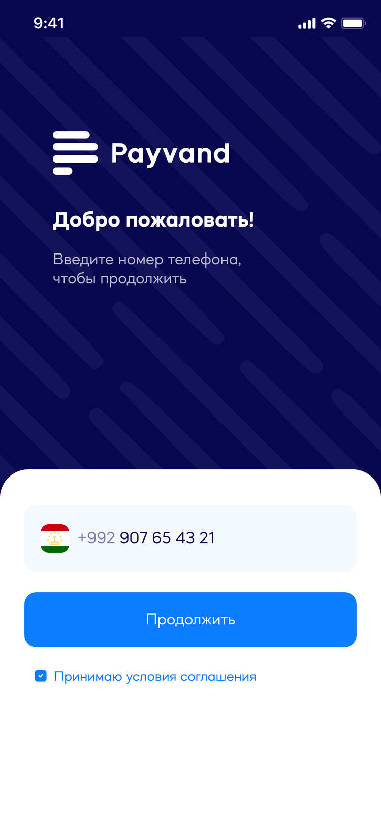
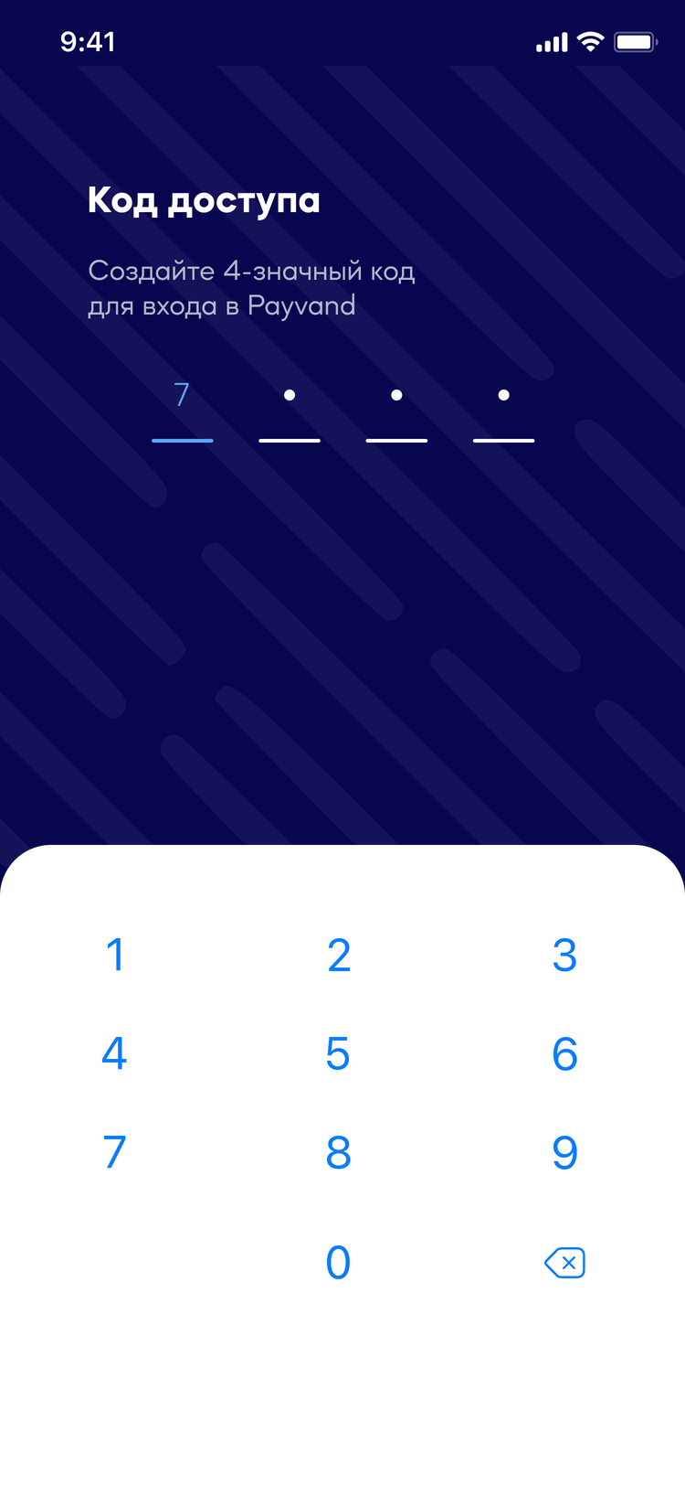
The app opens on a guest home screen: four corridors, ready to use. The invitation to register sits underneath them — “Зарегистрируйтесь для полного доступа ко всем функциям” (Sign up for full access to all features) — where it reads as an offer rather than a toll. Someone who signs up gets a saved profile, history and a 4-digit access code; someone who does not still gets their money home tonight. This is the one place where we could have copied the competitor and instead went one step further: Favri Intiqol removed the account from the flow, and we made removing it visible on the first screen.
One field on the whole screen, and the terms checkbox next to the button rather than buried under it.A 4-digit code you set yourself, so the second session is one gesture instead of another SMS.
04 · Favorites, nested three levels deep
Payvand Wallet
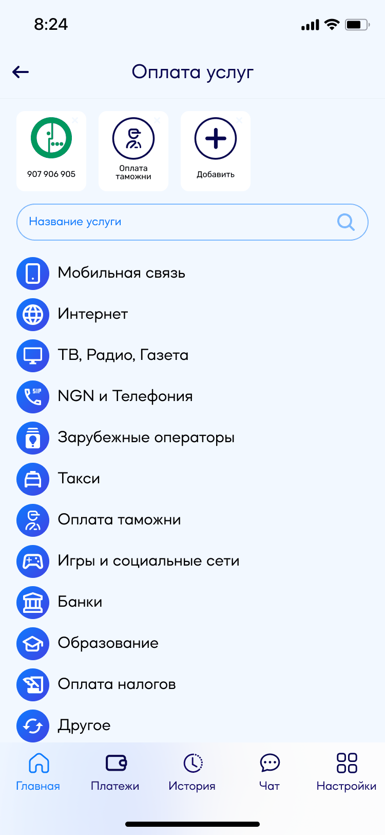
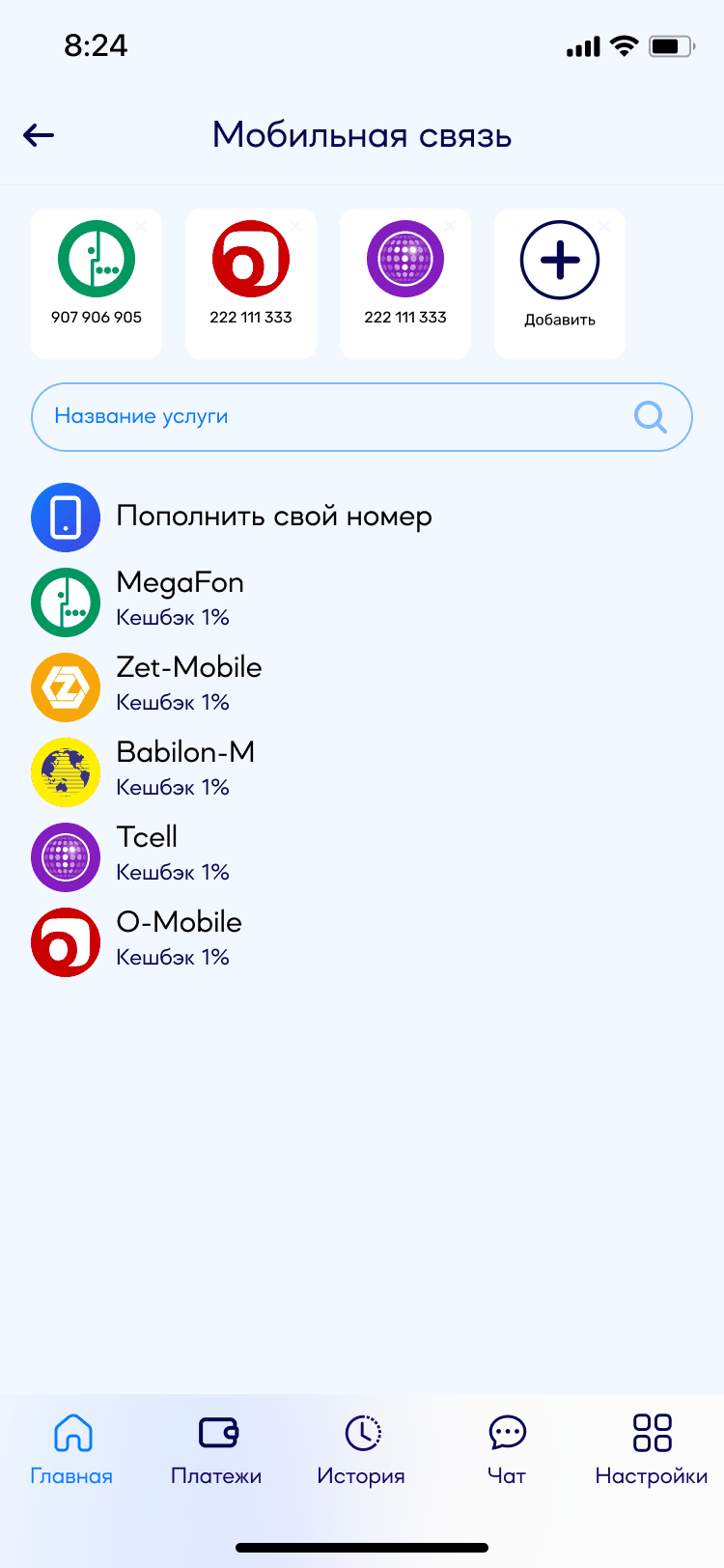
Favorites are not one list — they are three, each narrower than the last. The home screen keeps the handful you use weekly. The services page keeps the ones you use across categories. And inside a single category — mobile operators, say — there is a third row holding the numbers you have topped up before. You go one level deeper only when the level above missed.
What is actually saved is not the shortcut. It is the data you already typed. Pay customs duty once, come back a year later, and the taxpayer number and account are waiting — you do not have to remember them, find the paperwork, or call someone who does. On a normal top-up this removes four steps: pick the operator, type the number, type the amount, pay. Of everything in this app, that is the part people would miss first.
Home: “Избранные” (Favorites) sits above transfers and cards — the shortest path, for the things you do weekly.Services: the same row again, now across categories — and “Оплата таможни” (Customs payment) is sitting in it, saved from the last time somebody paid it.Mobile operators: a third row, holding the numbers already topped up — with the cashback on each.
05 · The rest of the wallet
Payvand Wallet
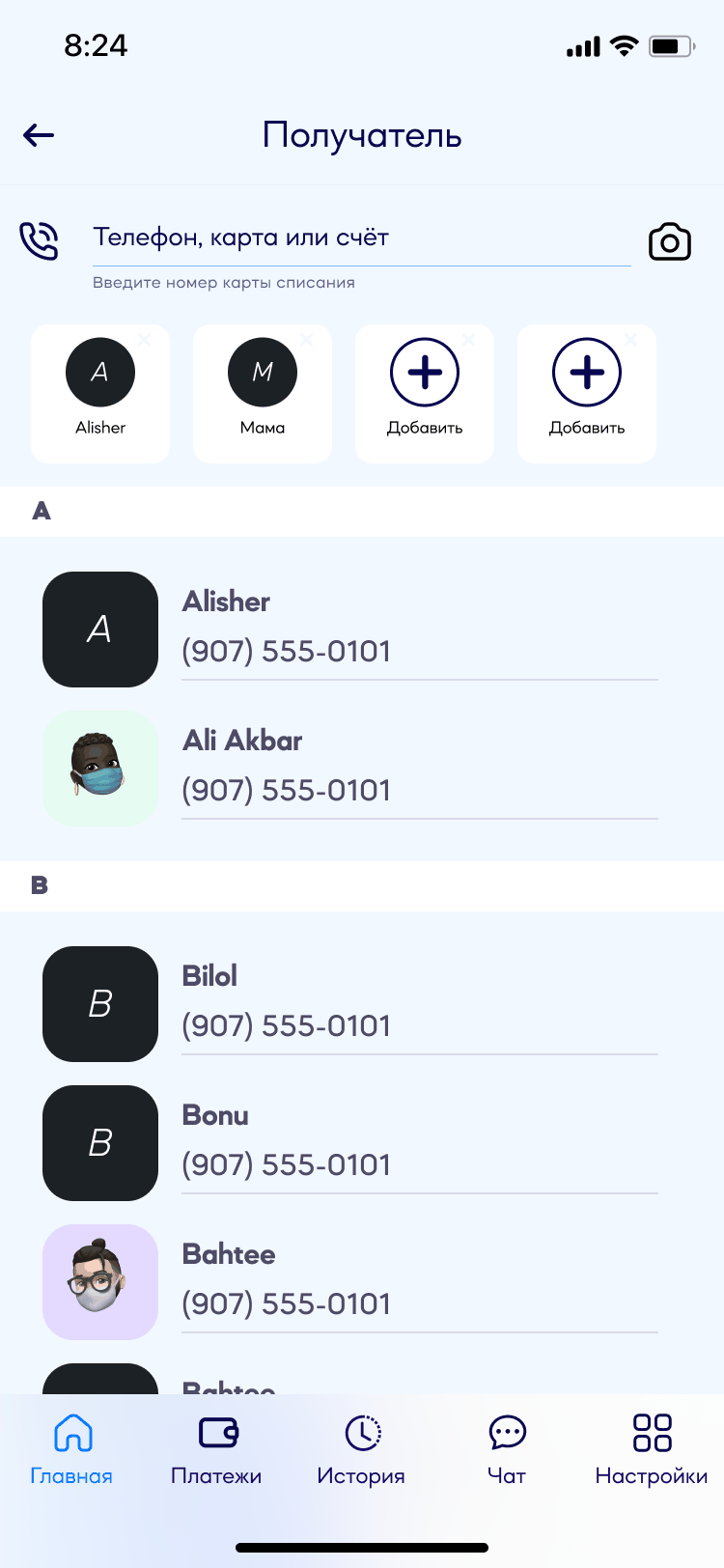
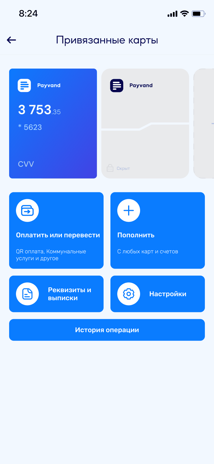
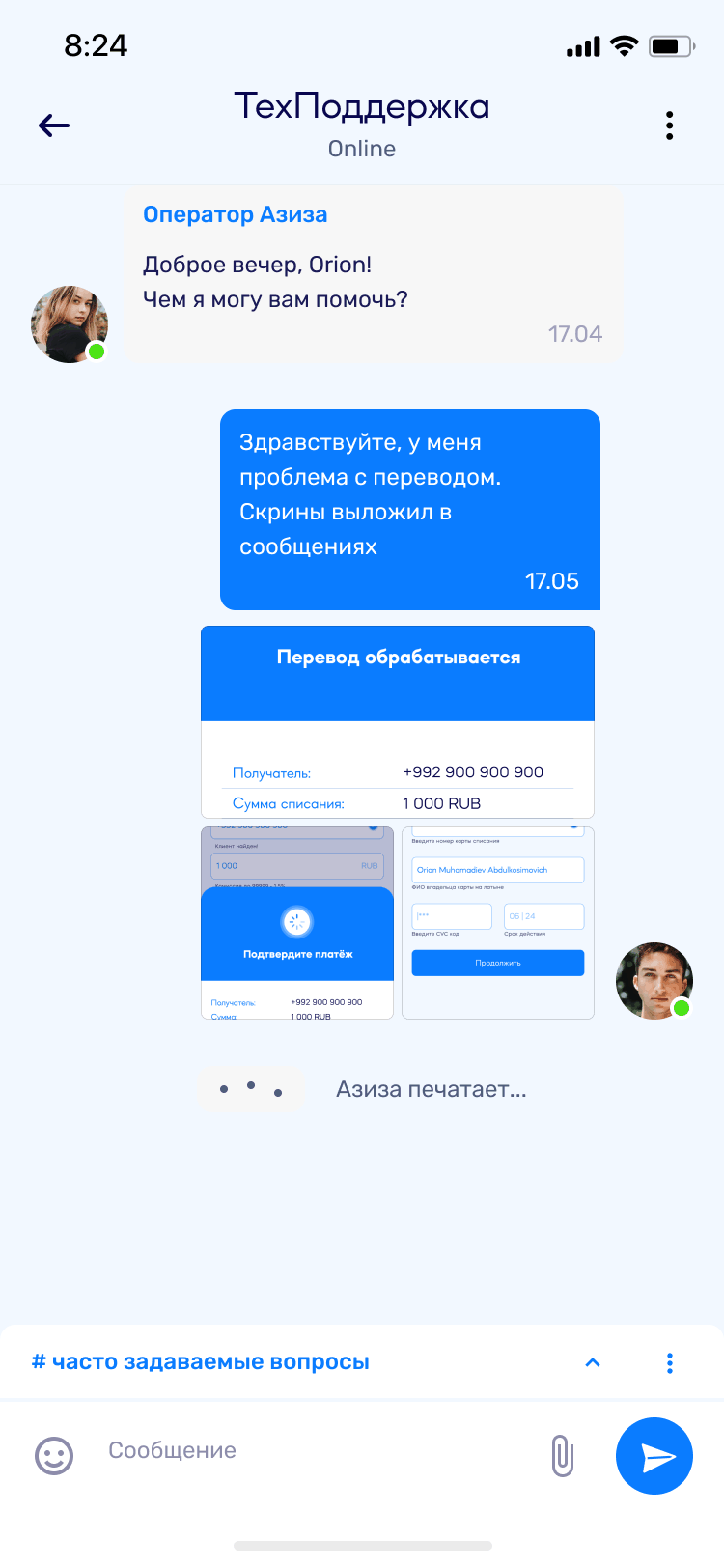
The surfaces that make it a bank rather than a payment button — the catalog underneath the favorites, transfers reaching into the phone book, the cards, and a support chat that is a real conversation rather than a form.
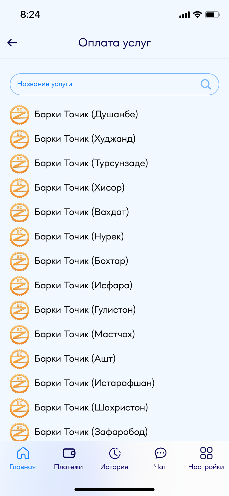
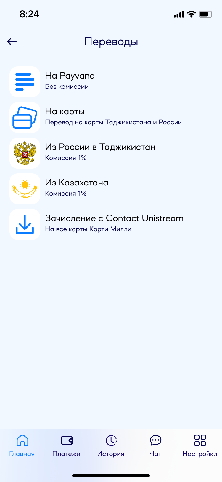
Utilities resolve to a city, not a company: Barqi Tojik in fourteen of them, with a search over the list.Transfers carry their price in the list — “Без комиссии” (No fee) on Payvand-to-Payvand, “Комиссия 1%” (1% fee) on the paid corridors.The recipient comes from the phone book — with the same favorites row on top, now holding “Alisher” and “Мама” (Mom).Cards: balance on the front, the rest behind four actions and a masked card that stays hidden until asked.Support is a chat: a named operator, a typing state, and the receipt plus screenshots attached straight into the thread.
What shipped
Both apps are in the stores today.
The design covered both home screens, the core flows and the shared component library. Payvand Wallet now carries 250+ services, QR payment with cashback and three languages; Payvand Transfers handles Russia→Tajikistan and the rest of the CIS.
COMPETITIVE POSITION
6
steps to complete a transfer, no account required — level with the standard Favri Intiqol had already set, which is what the job required.
COVERAGE
2+1
apps designed and shipped — Payvand Wallet on iOS and Android, Payvand Transfers alongside it — plus the Payvand UI system that ties them together.
INFRASTRUCTURE
3
languages supported from the start (RU, EN, TJ), with components tested for varying text lengths across all three.
Strategic framing
The two-app decision was the design's central argument. Tajikistan's remittance economy was enormous and underserved by apps that prioritized features over simplicity. Both apps shipped — domestic banking via familiarity with Alif Mobi, and remittances via a transfer experience built to the friction-free standard Favri Intiqol had set.
Lessons
What I'm taking into the next project.
What worked
Separating what I could prove from what I was told. The strongest version of the two-app argument turned out to be the one that needed no private numbers at all: the competitor had already shipped a second, emptier app. When a market publishes nothing, look for decisions competitors made in public — those are evidence you can still show a year later.
Designing the UI system before the second app. Building Payvand UI after Payments and before Transfer meant the second app was faster to design, with zero visual inconsistency between them.
Treating the competitor's strength as a design requirement, not a threat. Favri Intiqol won because of simplicity. The response wasn't to compete on features — it was to match that simplicity in the one context where it mattered most.
What I'd do differently
Test the 6-step flow earlier with actual migrant workers. The flow was designed from competitive analysis and interviews, but testing it with the specific audience — non-tech-savvy workers, not design-adjacent participants — would have caught usability gaps specific to that user group.
Define the QR merchant enrollment UX earlier. The consumer side of QR payment is clean. The merchant onboarding — how a small vendor in Dushanbe gets their static QR code — was left for later and would have shaped the consumer flow if designed in parallel.
One is still in the stores. The other the bank took down.
Payvand Wallet shipped in 2022 and is still live — install it and judge the flow with your own thumbs, that is a fairer test than any screenshot in a case study. Payvand Transfers shipped too, and was later withdrawn from the stores by the bank; what you see of it here is the design as it was built.