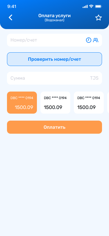
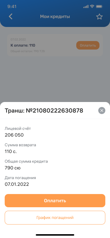
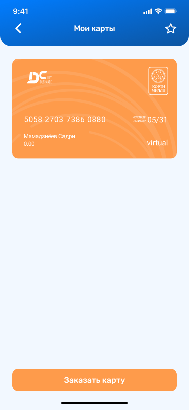
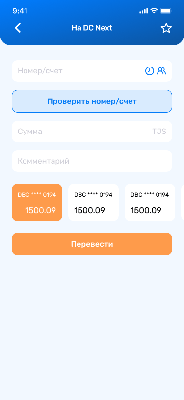
Replacing a legacy wallet with the bank's main digital product — payments, transfers, transport and 300+ city services, rebuilt around the two things people actually open a banking app for.
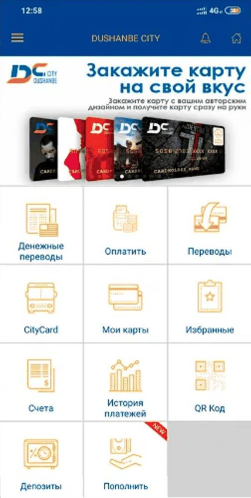
Dushanbe City Bank launched DC Wallet in 2018. By 2021 it was the bank's public face and its main channel to customers — and it was built like a folder of shortcuts. Eleven tiles of identical weight. No balance anywhere on the home screen. Paying for something sat next to "Favorites" as an equal.
The brief was to replace it with DC Next — an app that had to hold ordinary banking, city services, utility bills and public transport in one place, for a customer base that ranged from daily smartphone users to people opening a banking app for the first time in their lives.
I led the design end to end: information architecture, all core flows, the visual system and handoff. We were two designers; roughly 90% of the screens and the structural decisions were mine.
People open a banking app for one of two reasons: to see how much money they have, or to pay for something. DC Wallet's home screen answered neither without a tap.


I want to be precise about this: there were no moderated user interviews and no usability testing sessions on this project. What we did have was better than a guess and worse than a study — the bank's own usage data from the app it had been running since 2018, plus the operational knowledge of the teams handling support and payments.
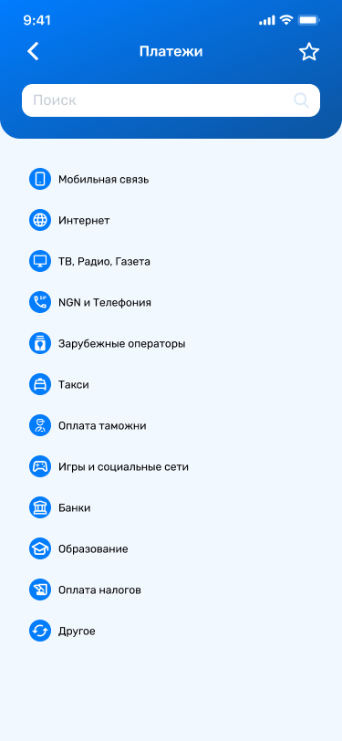
A small set of services carried the overwhelming majority of transactions — mobile top-ups, utilities, transfers. Those earned a place on the home screen. Everything else went into a catalog with search, instead of competing for the same visual space.
Ranking by aggregate frequency fixes the average user and fails the specific one. Someone paying the same kindergarten bill monthly gets no benefit from a global top-nine. That contradiction is what Favorites exists to resolve.
The customer base spanned people paying with QR every morning and people installing a banking app for the first time. The home screen had to be immediately legible to the second group without slowing down the first.
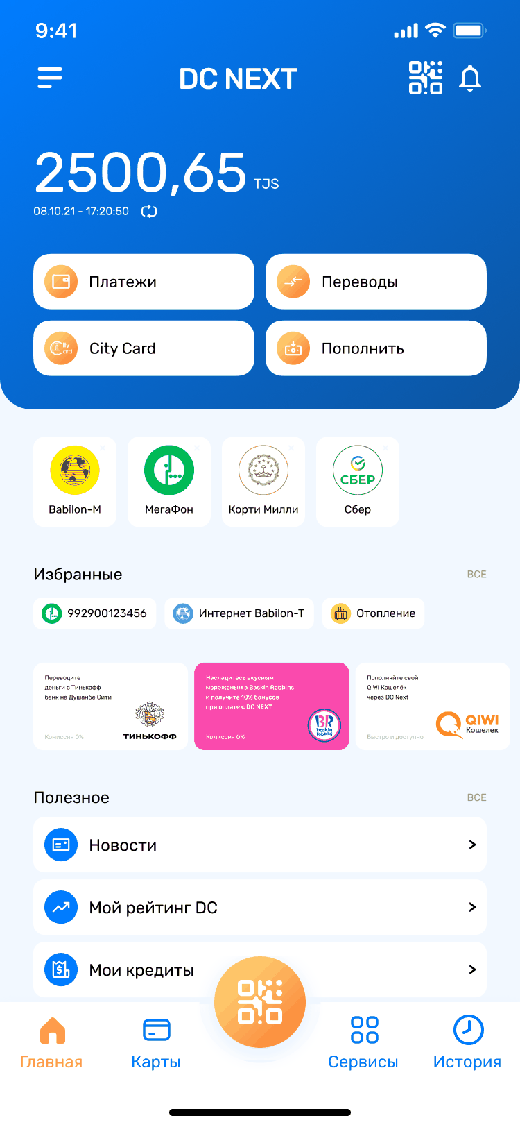
The card balance, the currency and the bonus total moved to the top of the home screen as a single block. It sounds obvious written down; it was the largest structural change in the redesign, because it demoted the service grid from "the home screen" to "one part of the home screen" — and that demotion is what made it possible to cut eleven equal tiles down to four primary actions.
Paying a merchant, topping up a wallet by QR and paying a bus fare are three different mental tasks — but technically they are the same act: scan a unique code, confirm an amount. Rather than build three entry points, the scanner became the center button of the tab bar — the only round, colored element in the navigation, present on every screen — and the flow after the scan adapts to whatever the code turns out to be.
A section that starts empty stays empty — most people never curate anything. So Favorites populates automatically from what the customer actually repeats, and remains fully editable: remove what you don't want, pin what the algorithm missed. The global ranking serves the average customer; this serves the specific one. Two mechanisms, one screen, no contradiction.
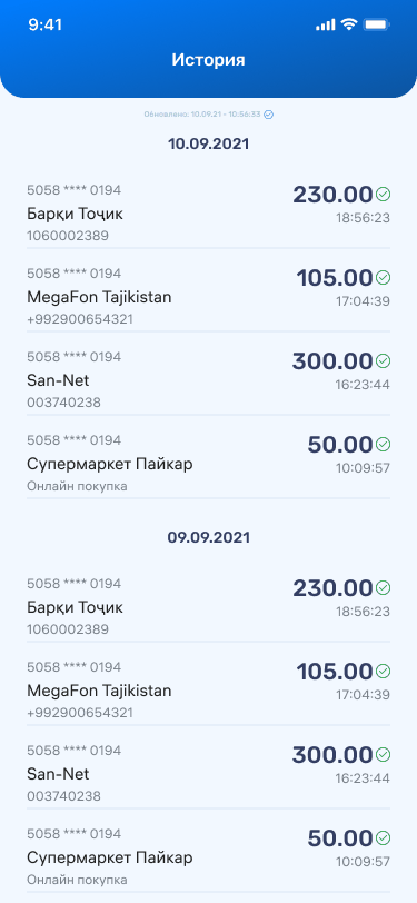
The first statement screen shipped as a correct list of operations that nobody could read quickly. The second version separated the statement from the operation log, added grouping and filters, and made a single transaction expandable into full detail with a repeat action. Two versions of the same screen exist in the file — I'd rather show both than pretend the first one was right.
Everything below shipped and is still in production as the foundation of the app — later generations of the product added new layers on top, but the navigation model and these flows are the ones I designed.


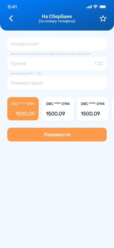
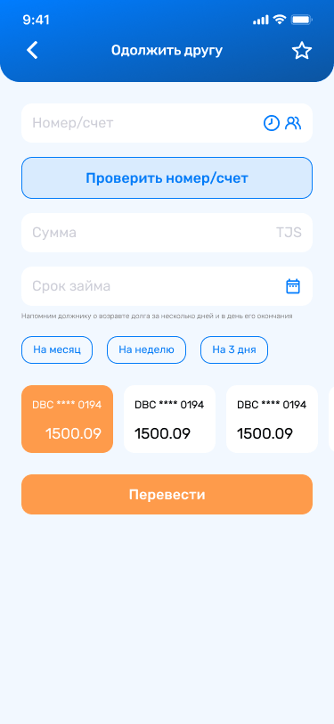
The transfer form plus one field: a due date. From there the app reminds the borrower a few days before and again on the day itself — so the lender never has to be the person who asks.
The three chips — three days, a week, a month — are there because that is how lending between people is actually agreed out loud. The hard part of lending to a friend was never the transfer; it was asking for it back. Moving that to the app is the whole idea. It was designed in full and never shipped: priorities moved elsewhere, and at the time that was a reasonable call by the bank. I show it because a portfolio of nothing but wins hides how the work actually goes.

registered users on an app serving a country of roughly ten million people.
monthly active users completing three or more transactions — not just opening the app.
total downloads, running at 2,500–3,000 per day at the time of measurement.
The app kept growing after 2022 under the team that took over: a mini-apps layer with third-party services, face-unlock security, sign-up through Telegram, parking and EV-charging partners. None of that is my work. The navigation model it all sits on — balance first, permanent tab bar, scanner in the center — is.
DC Next is still live on both stores — several product generations past the version I designed, built on the same navigation model.